All The Whites You Cannot Name
Cultural histories of unusual hues.
.
.
.
.
.
.
.
.
.
Last year, I spent a month in the Arctic Circle, pretending to write fiction at an residency on the Norwegian island of Sørøya, a place with 79 residents and one ferry that runs twice a day, at most. Driven mad by the continual bickering of a dozen artists stuck indoors in a ramshackle old farmhouse, I escaped frequently to the Hammerfest Hertz. I rented anonymous little cars and drove around Finnmark on long rambling drives to small frontier-like towns and fish-scented ports. Toward the end of the month, I decided to go and see Russia. I didn’t have a visa for entry, so when I got to the border at Elvenes, I just stood there for a shivering half hour, gazing through a chain-link fence at the pristine snow, the skinny naked grove of birches.
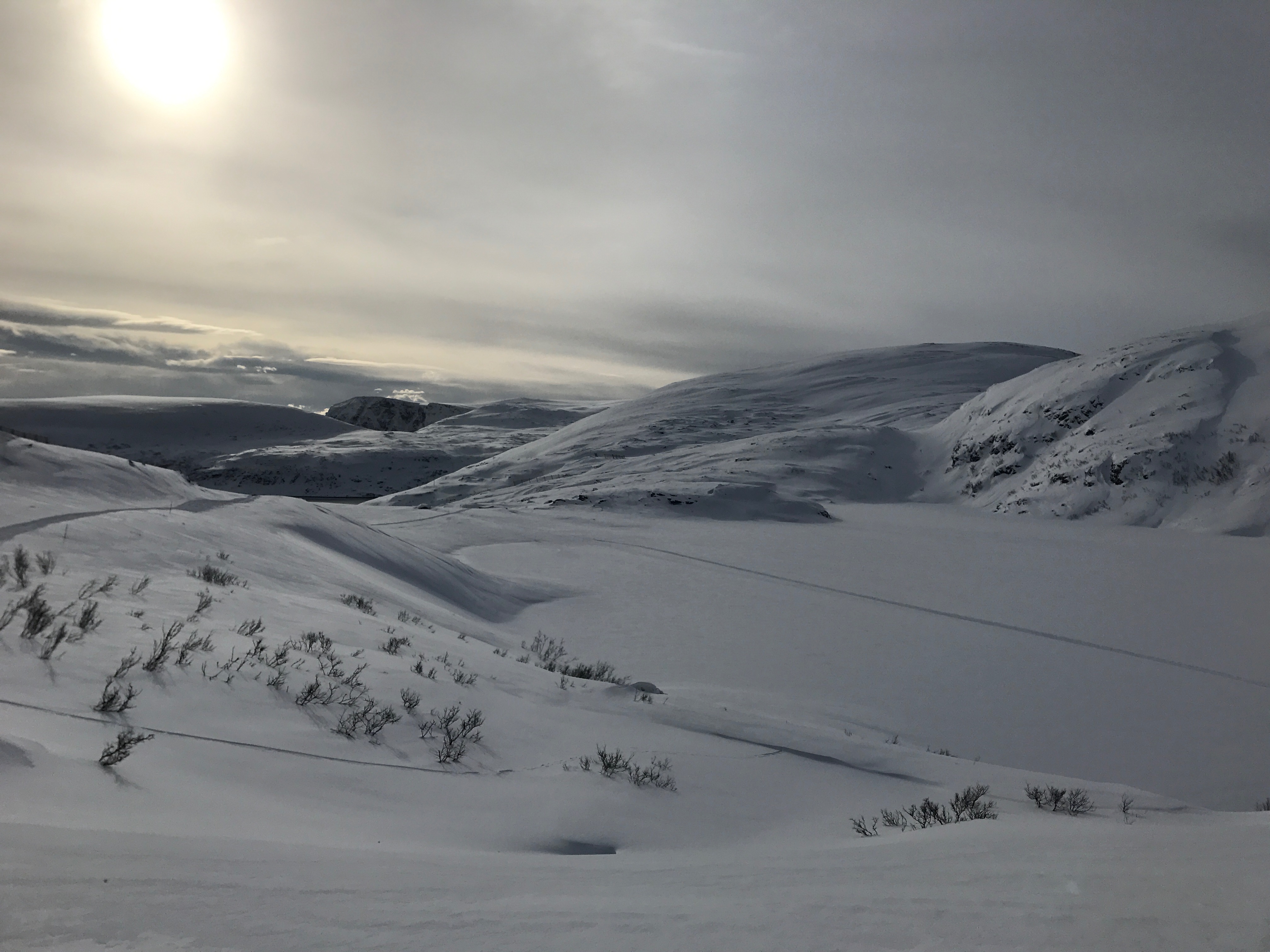
I had been warned repeatedly to stay far from the border. Russian guards, according to local lore, liked to taunt people into stepping over the invisible line, then arrest them for their encroaching toes. This never happened to me, though I secretly hoped I would meet a cantankerous border guard with a thick accent and excellent outerwear. Instead, I just saw snow. Over 300 miles of snow, reached through hours and hours of driving through all-white, treeless landscapes, punctuated by the occasional house, the rare petrol station. I learned that colorless landscapes often are richer in tone than you might expect; that pink and blue and yellow shine so strangely from colorless crystals. Refracted and reflected, light bends and changes in the icy north. Color is gone, but color is everywhere.
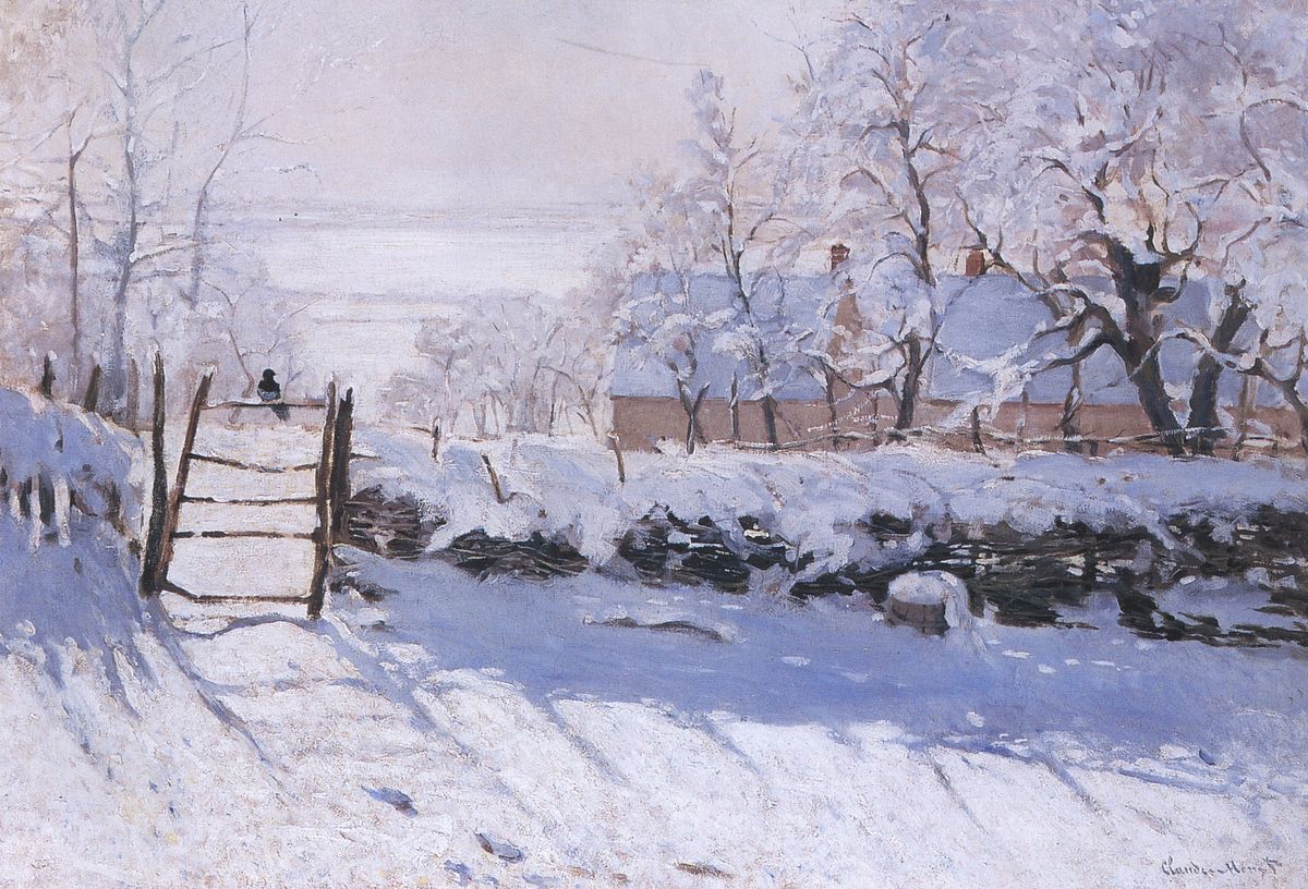
By Claude Monet – http://artmight.com/Artists/Claude-Monet-1840-1926/The-MagPie-1869-50751p.html, Public Domain, Link
The colorful colorlessness of snow is something the Impressionists understood well. Between 1868 and 1893, Claude Monet went wild painting snowy images that focused on the effet de neige, or the natural effect of snow (named for Gustave Caillebotte’s 1878 painting of snow-covered Paris rooftops). Although Impressionists had been painting en plein air for decades (ever since the invention of the field easel), Monet boldly took the tradition into colder territory, He became the master of snow painting, producing over 140 images of snowy landscapes; Alfred Sisley and Camille Pissarro added dozens more to the visual dialogue. These images were revolutionary because they revealed the lived experience of snow. Unlike earlier winter-themed works, like Pieter Bruegel the Elder’s Hunters in the Snow or The Massacres of the Innocents, snow was no longer viewed as flat and one-dimensional, but rather textured layers of sooty gray, soft blue, light mauve, and butter yellow, as intricate as an opal.

By Pieter Brueghel the Elder – WgFmzFNNN74nUg at Google Cultural Institute maximum zoom level, Public Domain, Link
White is everywhere, particularly at this time of year, and yet I have never met anyone who copped to loving white above all other colors—not even in the world of interior design, where I do most of my writing. Some may adore snow or cleanliness or purity or any of the other concepts we associate with white, but few love white (some sources say 2% of Americans list white as their favorite color, but many favorite color polls don’t even offer white as an option). White walls are king in a certain sector of bougie America, sure. Bright, semi-gloss or matte white paint has replaced the beige blandness of the early 2000s for many upscale homeowners (though you could also make an argument championing gray as the It Neutral of the 2010s—both are boringly ubiquitous).
There are plenty of decently good reasons why people paint their walls white. White reflects light, white looks clean, white photographs well, white looks great on Instagram and on light-emitting screens. But here’s the rub: what we call white is so often not-quite-white. It’s pearlescent, it’s tinged with brown, it’s ivory or it’s grayish or it has just the littlest bit of pink. And yet all these colors read as white to our eyes; we gauge them in comparison to the colors that surround it. Light sources matter, too. White walls lit by a south-facing window look warmer, while white walls hit with northern light look bluer.
By Lamiot – Own work, CC BY-SA 3.0, Link
From a physics perspective, white is all the wavelengths of visible light seen at once. It’s red, orange, yellow, green, blue, and purple, beamed into our eyes at one moment, melded to form white. Snowdrifts look white because they are made of millions of tiny translucent ice crystals. As ThoughtCo. explains,
Light does not pass through ice easily. Instead, it bounces around back and forth within the ice crystals. As the light inside an ice crystal bounces around off the interior surfaces, some light is reflected and other light is absorbed. With the millions of ice crystals in a layer of snow, all this bouncing, reflecting, and absorbing leads to a neutral ground. That means there is no preference to one side of the visible spectrum (red) or the other side (violet) to be absorbed or reflected. The sum total of all that bouncing leads to white.
In clear, noonday light, snow appears bright white. As the sun moves along the horizon, the atmosphere begins to scatter the light waves around, absorbing some wavelengths of color (like blue and green), which creates a pink sunset, a yellow dawn. A similar thing happens on the walls of your white room. Light turns those chalky China white walls into a blushy pink or a gloomy purple, depending on the season, the time of day, and the conditions of the atmosphere. Sometimes, we see these colors clearly and easily, but when the light source is unknown, our brains automatically compensate for the shifts in lighting thanks to an effect called color constancy. (You might be familiar with the concept, since it entered pop culture alongside the weird blue dress meme of 2015.)
The mercurial nature of white makes it particularly difficult to define. White is a function of light waves, but it’s also an idea. One could define white as simply “all the wavelengths of color mixed together” but that doesn’t really capture how we use the word white. Like red or blue or green, we call a variety of light shades “white” regardless of whether or not they are truly white. Some of these whites appear “pure” while others feel like the lightest whispers of other colors—barely-there blue, almost pink, kinda yellow. But since color always exists on a spectrum, and since our naming conventions for colors are haphazard and strange, born from the chaos of whim and repeated use rather than any logical structure, there are plenty of pale colors that have been deemed white. Let’s meet a few of them.
![]()
Ghost White
An Internet color with the hex code #f8f8ff, ghost white traces its name back to 1987 (the year “X11 web colors” were born). The extremely pale blue supposedly represents what a ghost might look like were it digital, and it’s true that there’s a long tradition of describing spirits as white-clad figures, pale, drawn, and eternally mourning. There are dozens of ghost stories about “a lady in white.” The Netherlands has witte wieven or witte joffers (white women or white maidens) who go around punishing men for their misdeeds and helping women in childbirth. The White Lady of Balete Drive is a popular story in the Philippines, and Estonia has the White Lady of Haapasalu Castle. (Interestingly enough, UK-based ghouls are often green rather than white.)
Navajo White
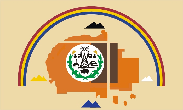
By Navajohistory (Own work) [CC BY-SA 4.0], via Wikimedia Commons
Titanium White
According to the web exhibit Pigments through the Ages, titanium white was the “strongest, most brilliant white available to artists in the entire history of art.” This ultra-light, ultra-opaque paint was made from rutile ore (mined mainly in Norway). It has “twice the opacity of pure lead white” and “outstanding” chemical stability. But there are downsides to titanium white. It has a very slight bluish tone and can be overbearing (it’s easy to add too much titanium white when painting) so many artists prefer zinc white, which is more translucent and has 1/10th the tinting power of titanium white.
Anti-Flash White
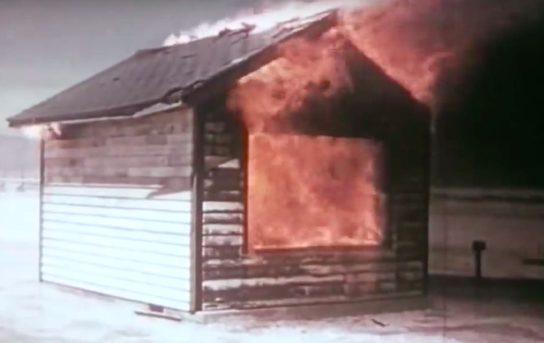
A house painted atomic white, after a nuclear test. Screenshot via YouTube.
In 1953, a series of nuclear tests in Nevada found that a dummy house with a fresh coat of white paint and a tidy front yard was less likely to suffer damage during a blast than similar buildings with faded, chipped paint and yards “littered with trash.” In Whole World on Fire: Organizations, Knowledge, and Nuclear Weapons Devastation, Lynn Eden quotes the original report, which found that the white-painted home “suffered scorching only.”

By USN – Official U.S. Navy photograph [1] from the Naval History and Heritage Command [2], Public Domain, Link
![[1]](http://www.history.navy.mil/planes/e-6.jpg)
Isabelline
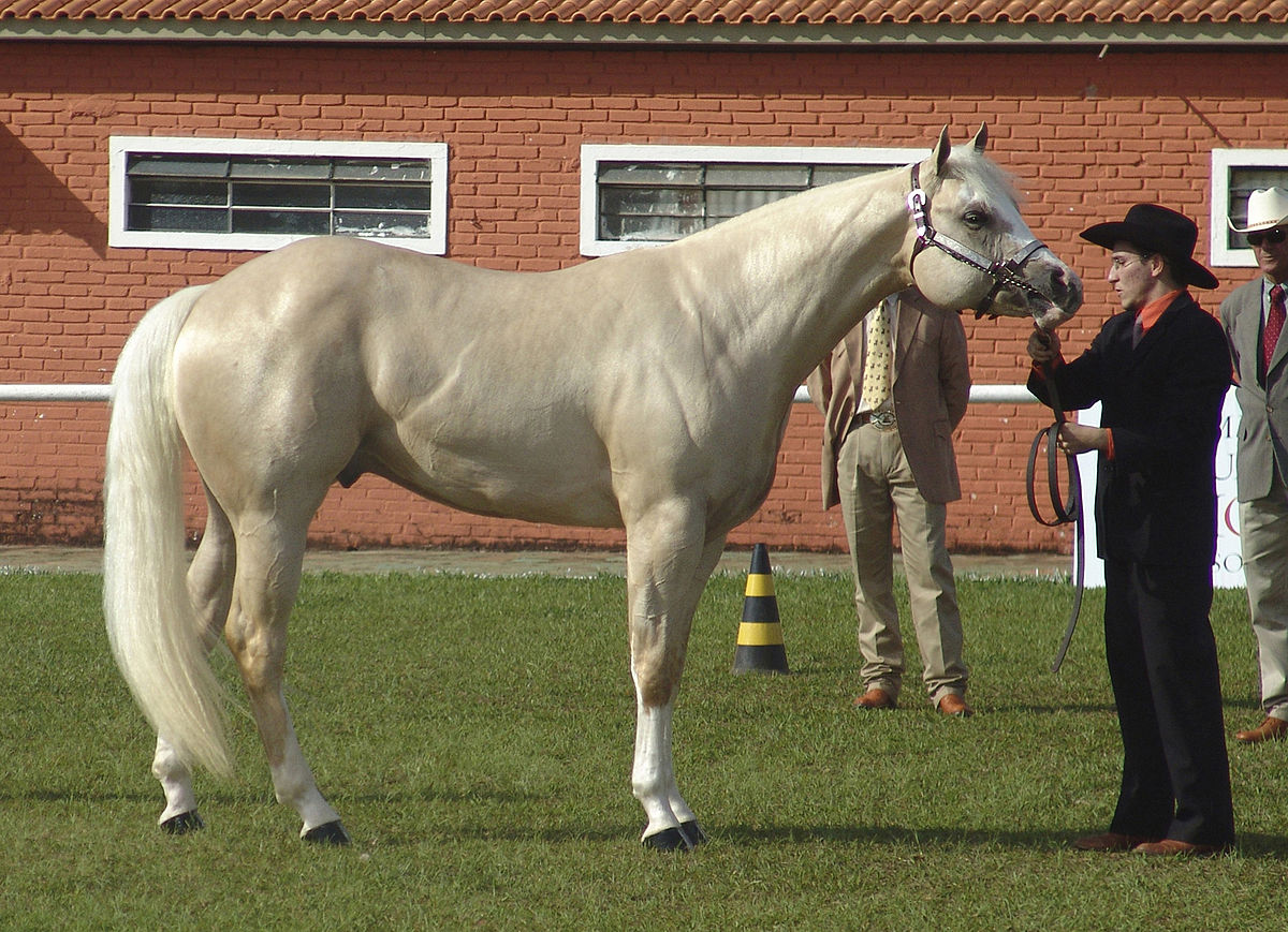
By José Reynaldo da Fonseca – Own work, CC BY 2.5, Link
The saccharine-sounding name of this particular off-white belies its inglorious origins. According to one tale, the color is named for a pair of very dirty panties worn by Isabella, Archduchess of Austria. In 1601, her father, Philip II of Spain, laid siege to Ostend. Isabella vowed that she wouldn’t change her underwear until the city had fallen. The siege lasted for three years. It’s fairly likely that this story is just a fable (the color name was used several years prior to Isabella’s laundry abstention in an inventory of Queen Elizabeth I’s wardrobe) but the color Isabelline—a “moderate yellowish brown to light olive brown that is lighter and stronger than drab clay or medal bronze,” according to Merriam-Webster—has been forever tainted by this dirty little yarn. As a color name, Isabelline has fallen out of fashion, except with zoologists or horse people—it’s a common descriptor for a certain kind of white horse, as well as various species of bats, fungi, birds, and light-feathered penguins.
Cosmic Latte

via NASA
If the universe were distilled down to one color, it would be a yellowish beige, a creamy off-white that’s a hair darker (and warmer) than ivory and about as drab and unappealing as a smile full of unbrushed teeth. In 2009, Ivan Baldry and Karl Glazebrook from John Hopkins University decided to answer the question: What’s the average color of the universe? They combined light from over 200,000 galaxies within two billion light years of Earth and found that, if you were to “put the universe in a box” and gaze upon it, you’d see a milky beige. A previous study had found that the color of the universe was a light teal, but turns out that the computer program they were using to run the data had erroneously been programmed to recognize a pinky hue as “white,” which skewed the final color in the opposite direction. After they corrected for this mistake, Baldry and Glazebrook held a contest to name the universal color. Entries included some dippy punny names like skyvory and univeige, but they ultimately settled on cosmic latte.
Cremnitz White
By Dutch Boy paints – The Daily Ardmoreite. (Ardmore, Okla.), 20 Sept. 1912. Chronicling America: Historic American Newspapers. Lib. of Congress. <http://chroniclingamerica.loc.gov/lccn/sn85042303/1912-09-20/ed-1/seq-3/>, Public Domain, Link
Named for a town in central Slovakia, Cremnitz white has been prized by artists for its opacity, heavy weight, and bright color. But Cremnitz white has another, more descriptive name: Lead white. Cremnitz sounds more exotic and much friendlier than lead white, which is why many paint companies still sell lead-based oil paints under this name, despite the fact that true Cremnitz white hasn’t been produced in Slovakia since 1938. Other appellations for this dense white paint include slate white, flake white, Berlin white, Nottingham white, and Vienna white, but no matter what you call it, it’s generally all the same thing on a chemical level—2PbCO3·Pb(OH)2.
Artists have been using lead-based white paints for thousands of years. Around 300 BCE, Greek philosopher Theophrastus of Eresos described the preparation of white lead in his treatise On Stones:
Lead is placed in earthen vessels over sharp vinegar, and after it has acquired some thickness of a sort of rust, which it commonly does in about ten days, they open the vessels and scrape it off, as it were, in a sort of foulness; they then place the lead over vinegar again, repeating over and over again the same method of scraping it till it has wholly dissolved. What has been scraped off they then beat to powder and boil for a long time, and what at last subsides to the bottom of the vessel is ceruse.
This equation—lead plus heat plus acid—is known as the Dutch method. Over the years, the preparation of white lead was tweaked and refined, but the basic elements remained the same. The resulting powder would be mixed with oil (linseed or vegetable of some sort) and used as paint. Starting in the 15th century, European courtiers began mixing the white powder with vinegar and applying it to their faces. This mixture was known as Venetian ceruse, or the spirits of Saturn. Queen Elizabeth I was a big fan—she liked how pale it made her, how well it hid her smallpox scars. Over time, the use of Venetian ceruse would lead to hair loss, skin discoloration, rotted teeth, irritability, brain damage, infertility, and death.

By Nicholas Hilliard (called) (1547 – 1619)Details of artist on Google Art Project – VgG8ronTPh8jDg at Google Cultural Institute maximum zoom level, Public Domain, Link
Even though we’ve known about lead poisoning since the 4th century BCE when Hippocrates described the symptoms, it’s 2018 and we’re still figuring out how to deal with lead paint. It’s a strange failure of foresight, or a particularly gross example of the repetitive nature of human folly. Cremnitz is the ur-white, in a sense. White worship, and the long-held association with the color white and cleanliness, has caused countless deaths and lasting damage to individual bodies and entire societies. This brightest, clearest, oldest white, is also perhaps also the darkest white, the one that reveals the depravity of this fixation. Lead, dense and deadly, is the weighty cost of the truest white.