How 'Minority Report' Trapped Us In A World Of Bad Interfaces
by Christian Brown

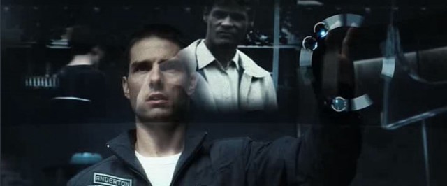
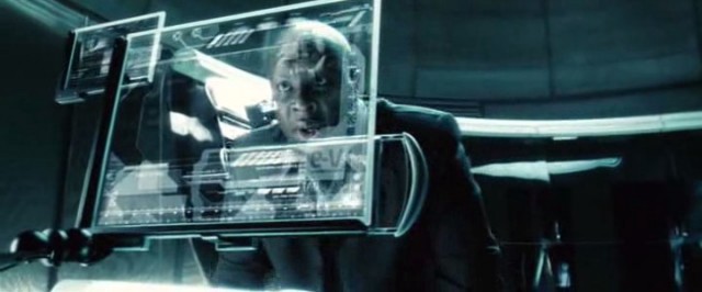
I wish I could get away with charging my clients a fee for every time they say “Minority Report” to me. I’m a commercial artist in L.A., and 90% of commercial art is shutting up and giving the client what they want. That means I spend a lot of time trying to repackage Steven Spielberg’s vision of the future: floating graphical windows with video hovering in them, typography flickering and animating in response to actors’ actions, interfaces appearing and disappearing when fingers reach out to poke them. In short, building a virtual iPad interface, hovering in front of the actor using it. In Spielberg’s future, you only have to twirl your fingers at a computer screen to make it do what you want. It looks cool enough, but it’s time for us to let it go: we’ve built our graphics and our electronics around interface eye candy, rather than trying to come up with new and more effective ways to control our real and imaginary gadgets. The best thing you can say about touchscreens are they look good on camera and they’re better than T9 texting, which is kind of like being better than fax machines.
The next in a short series about our strongest movie opinions,
past and present.
It’s important, of course, to put this in context. Minority Report came out in 2002, and we had touchscreens for a long time before then. If you want to feel really let down by the future, here’s the Prius computerscreen-o-matic as interpreted by a 1987 Buick Riviera. Even multitouch had been played with before the movie came out — just in labs, and very expensively. Minority Report’s cleverness was not in inventing new technology from whole cloth, but in extrapolating existing tech into practical, consumer-friendly products.
In the run-up to production on the movie, Spielberg invited a panel of tech experts and self-identified futurists to an “idea summit.” Their goal was to create a plausible description of the world of 2054 based on what was current, cutting-edge technology, rather than just constructing one from nothing. Self-driving cars, retina-scanning billboards and criminal-identifying spiderbots all made the resulting 80-page “2054 bible,” but the most influential invention of the futurists is the gesture-controlled display.
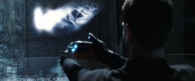
In the movie, when Tom Cruise straps on his infogloves and starts rummaging through the dreams of the psychic precogs, classical music begins to play. He stands in front of a semicircular computer screen, the size of a wall, and uses his hands to fast forward and rewind, to zoom in and out and rotate the screen. Many of them are laughable — he places one hand in front of another to zoom in, like a vertical hand jive. He goes to shake someone’s hand and all his files are thrown down into the corner. It’s, frankly, absurd — especially if you haven’t seen it since 2002. THIS is the thing tech reviewers are always comparing a new interface to? Even so, there are recognizable gestures that anyone with an iPhone has used. The pinch-zoom, the rotation, and the swipe-to-dismiss are all used daily by smartphone users. And while Cruise’s begloved gesticulation is silly on its face, everyone else in the movie has to use a regular old multitouch computer monitor.

If there’s anyone to blame for the gesture-based interface Cruise uses, it’s virtual reality engineer Jaron Lanier, and the most outspoken member of the think tank, entrepreneur and MIT Media Lab alum John Underkoffler. Lanier, who brought working prototypes of glove-tracking hardware to the idea summit, eventually went on to develop the Kinect gesture-recognition system for the Xbox 360. But it was Underkoffler who took Spielberg’s request for an interface that’s like “conducting an orchestra” and turned it into the gestures we see on screen. In a 2012 interview, Underkoffler said he “devised this whole kind of sign language for interacting with this computer, for controlling the flow of all this information.”
The problem is, that sign language has gotten stuck in our cultural mind, like a particularly virulent earworm. In 2006, a year before the iPhone’s debut, Jeff Han gave a TED Talk about multitouch gestures, demonstrating the use of them to manipulate photos and globes. Throughout, he described gestures as an “interfaceless” technology, a way to intuitively zoom in and out and rotate around images without a “magnifying glass tool.” This is, of course, nonsense. While touching something to get more info may be intuitive, every other gesture demonstrated is noteworthy for how NON-instinctive it is. Does pressing with one hand and dragging with another really intuitively represent rotation? Especially of a 3D object, like a globe?
There are better ways to handle spatial ideas, ways which are more in line with the way our bodies are built. Human hands and fingers are good at feeling texture and detail, and good at gripping things — neither of which touch interfaces take advantage of. The real future of interfaces will take advantage of our natural abilities to tell the difference between textures, to use our hands to do things without looking at them — they’ll involve haptic feedback and interfaces that don’t even exist, so your phone shows you information you might want without you even needing to unlock and interact with it. But these ideas are elegant, understated, and impossible to understand when shown on camera.
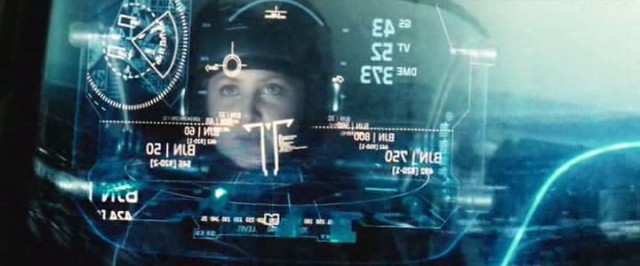
The reality is, there’s a huge gap between what looks good on film and what is natural to use. Movie computers are designed to look cinemagenic. Mostly this translates into transparent screens and huge fonts — things nobody would try and put on a phone. But touch-screen interfaces, which look great because of how easy it is to tell what a user is doing on camera, have managed to take over our lives.


This isn’t to argue that touchscreens are useless. They’re a great way to cheaply interact with a small electronic device — like, say, a phone. But the problem is the outsized role the touchscreen has taken in our pop cultural understanding of computer interfaces. The “hovering multitouch” interfaces of Iron Man 2, Total Recall, and Tron have become pop culture’s vision of what’s state-of-the-art, even outside of Spielberg’s movie. None of these are fundamentally different from Minority Report’s technoscreen — they just have varying distances between fingertip and graphic. But all of them are, essentially, what design critic Bret Victor has called “pictures-under-glass.” They are interfaces that look good, rather than interfaces that work well.
Put another way: If Jeff Han had designed a keyless entry system for a car, it would’ve involved dragging a secret gesture on the car’s window instead of the car automatically unlocking when you open the handle if you have the key in your pocket.
And at the end of the day, it’s visual accessibility driving this trend. Hopefully one day we’ll reach the point where filmmakers don’t want computers to look like conducting an orchestra, and we’ll be able to back out of this interface cul-de-sac and find our way forward into a genuinely natural way of using our devices. Like porn, techno interfaces are more focused on what looks good than what feels good. And like porn, it’s pretty hard to get people to stop buying. Here, I’ll make a deal: If we’re gonna be focusing all our cultural attention on something so impractically sexy, can it be jetpacks instead?
Previously in series: Why We Need Best Supporting-Supporting Actor & Actress Categories
Christian Brown is an animator in Los Angeles.
