How To Read This Morning's Weather Map
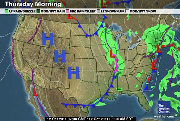
Here’s this morning’s weather map, straight from the Weather Channel website. What do we see? Well, it’s going to be a purple line in California, typical for this time of year. Mountain West will see a lot of Hs — how nice for them! And the lumpy, blue-and-red line down the East Coast will stay for the remainder of the week into the weekend. Wait, what? Okay, so maybe when you look at a weather map you have a vague sense of what’s being indicated. Like, “hmm, those green clouds look ominous.” But how did they get there? And what’s going on with those other lines, letters and bumps?
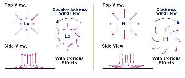
To understand what drives weather patterns, we need to first review the Coriolis Effect. It’ll be quick, I promise. Now: imagine yourself at the North Pole aiming for a target at the Equator. In this imaginary scenario you have a great arm and throw in a perfectly straight line. Give yourself a fancy hat too; why not? If this throw was on a stationary planet, you would hit the target. But you’re throwing on a constantly rotating planet and the target is constantly moving with the earth, you would miss the target even though the ball took a perfectly straight path. From the North Pole, your ball would appear to deflect to the right of the target. In reality, the target moved left with the earth’s rotation. That’s the Coriolis Effect, radically simplified, in action. Which is great if you need a science-y excuse for being terrible at catching things, but what does that mean for the weather?
Air masses are constantly moving from areas of high pressure (the Hs on the map) to low pressure (the Ls), but the rotation of the earth prevents the air from moving from H to L in a perfectly straight line. It deflects, like your ball, to the right. At the center of a low pressure system, air is rushing in from all directions. The rightward curve creates a spinning vortex of rising air, which is a lot less terrifying than it sounds. It happens, literally, all the time. Where there’s low pressure, there’s a spinning vortex of rising air. There’s one over Illinois as I write this and no one is panicking. Most people don’t realize there’s anything happening at all. Other than the rain, of course. Folks probably notice the rain.
It’s the low atmospheric pressure that allows air to rise. When air rises high enough it cools and the moisture present in the air condenses to form clouds. When the clouds are completely saturated, it rains. If there’s an L on the weather map closing in on your area, clouds and likely rain are headed your way. High pressure, on the other hand, means that the air is being forced downward — cloud formation is prevented. Sunny and clear days come with high pressure areas. That big H on the map is bringing clear weather to, for example, Colorado. It’s going to be pretty gorgeous in Denver this morning, and probably through the weekend. High pressure areas don’t move too fast.
All of this moving air, of course, creates wind. Air masses flow from areas of high pressure to areas of low pressure. The closer the pressure centers are to each other, the stronger the wind blows. Regrettably for our purposes but happily otherwise, there isn’t a great example of high winds on the lower 48 today. But you see those white lines? Those are isobars, and they connect points of equal barometric pressure. The closer together they are, the stronger the wind will blow there. Now let’s look at the areas not covered by giant letters. What’s going on with those bright, bumpy lines? Those are fronts. Fronts are masses of air with different temperatures and densities interacting with one another.
A warm front, symbolized on a weather map by a red line dotted with half circles, is a mass of warm air advancing upon a mass of cooler air. Warm fronts are slow moving, and somewhat short lived. When smooshed up next to another front, as is happening just south of New England, warm air rises above a mass of cooler air, giant clouds form and typically bring with them a lot of rain that clears quickly once the front has passed. (Here are a pair of basic animations of warm and cold fronts to help you visualize this.)
A cold front, symbolized on a weather map by a blue line strung with triangles is a mass of cooler air wedging itself beneath a mass of warm air. Cold fronts move faster and more forcefully than warm fronts. They are accompanied by dropping temperatures and sometimes, but not always, rain. Have you ever noticed how the air sometimes changes right before it rains? Things become more crisp and things just… smell different? That’s the cooler, drier air pushing the warmer, more humid air up and away (also, your sense of smell is stronger in high humidity, so you’re just smelling less, but that’s neither here nor there). The cold front moving across the Southeast right now is bringing light rain in some areas, but the air mass isn’t moist enough to cause heavy precipitation. They are, however, followed by the most delightful little cumulus clouds.
There is an occluded front, the bright purple line with both half circles and triangles, happening over the Kentucky/Indiana border. That means a cold front is overtaking a warm front: a mass of cooler air is passing under a mass of warm air trying to slide over a mass of cool air. Though it’s still too warm yet, occluded fronts are the type of air mass intermingling that brings thundersnow. Currently, though, just thunderstorms. And the other dark purple dashed lines? Those are troughs, elongated areas of low pressure. Not quite a spinning vortex, but capable of causing enough disturbance to warrant its own type of line on the map. In the Northern Hemisphere, air rises to the east of the line and sinks to the west. Thus, it is cloudier and rainier east of the line, and more settled west of it.
And finally, a stationary front, the red and blue line, lies just off the East Coast. This is when two air masses just don’t know what to do with each other as neither is strong enough to challenge the other. It is, as the name would suggest, not going anywhere anytime soon and will just dissipate on its own if neither air mass become strong enough to overtake the other. What does this mean on the ground? Clouds, mostly. If the air is already moist it will storm but it’s not as likely as a straightforward cold or warm front.
What can you take away from this, so that you can take a quick glance at a weather map and know what’s coming your way? If there’s a front approaching, really any kind of front, bring an umbrella. If the isolines are clustered, wear a jacket. If there’s a big H, remember your sunglasses; and if there’s a big L, you should probably put the white t shirt back in the closet and save it for a day when there isn’t any kind of symbol at all over your town.
Victoria Johnson is a cartographer and this is her Tumblr.
Weather map snagged from The Weather Channel. Coriolis chart courtesy of astrowiki.