How This Cool Toothbrush Company Made an Awesome eCommerce Website
by Logan Sachon

Sponsored by Squarespace.
The Goodwell Co. makes sustainable and compostable toothbrushes and flossers, and that’s just the beginning of what the company hopes to accomplish. But before they could sell their first toothbrush, they had to have a website, and that’s where Squarespace came in. Patrick Triato, who co-founded the company with Aaron Feiger, spoke to us about the company and their super slick Squarespace-made site, www.thegoodwellcompany.com.
Hi, Patrick. Tell me about The Goodwell Company! How was it born?
The Goodwell Co. was born out of the perfect storm of circumstances. I’ve been bringing products to market for about 15 years and I hit a point in my career where I didn’t want to continue leaving a “legacy of trash,” so to speak. I’ve been a product designer and engineer on literally hundreds of products, and I wanted to build something that I could truly stand behind and be proud of mass manufacturing. There is also a market and ideological shift going on where greener products and sustainable forms of living regarding products, lifestyle, architecture, transit, and energy are disrupting the status quo. Goodwell Co. is changing the way we manufacture and consume personal care, starting with leading the way in smart, sustainable, and subscription based oral care.
At what point did you decide that you needed a website?
Immediately. To truly disrupt our market, we needed to go direct to consumer, which means launching a website almost before we even have finished products to sell!
How important is your website to your business?
Absolutely crucial. Right now our sales are 95% B2C through our website, and 5% at retail locations.
Had you built a website before?
I had a hand in building a few websites before Squarespace existed, and the task was always daunting. It took a team of people to get the most basic website up and running — and that is before you plug in e-commerce!
How did you choose Squarespace?
Choosing Squarespace was easy; the free trial is honestly what had me sold. I tried it out for a few days, watched some tutorials, asked a few questions, and the next thing I knew I had a beautifully clean site ready to launch.
Can you walk me through how you designed it?
We sketched out a user experience map of how we wanted someone to click and scroll through our site, then we looked at the templates to see which one was the closest to our vision. We had to add a few custom coded tweaks that were pretty basic and ended up with exactly what we envisioned.
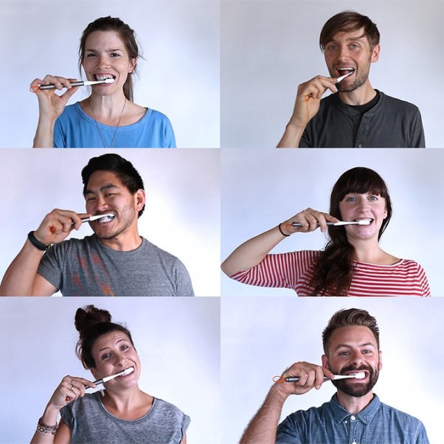
Tell me about your cheeky brushing teeth gifs! I love them.
I love that you love it, that is exactly what we were going for. Our culture at Goodwell is key to our products and our vision for the future, it’s not like brushing your teeth is going to go out of style any time soon, so we want to do unexpected and creative things all the time to keep it fresh and fun.
Do you feel like the site can grow with your company?
I don’t see any reason why not at this point, catch up with us in a year and ask the same question!
What’s the feedback on the site been like?
Great feedback, there literally hasn’t been a single complaint about where to find something or that something has crashed or errored out, which is pretty amazing.
You’re obviously a designer. How do you feel about Squarespace for non-designers?
Whether or not you are a designer, you’ve undoubtedly heard the saying,” It’s all about having the right tool for the job.” In a nutshell, this is how I feel about Squarespace.
