Three Lost Days at the Biggest Architecture Show in the World
by Michael Eisenbrey

People often say that their hometowns or favorite cities are unique. “There’s no place like New York,” they declare. This is true, up to a point — no two cities are exactly alike — but, broadly speaking, it’s nonsense. Almost every modern city is like New York, because nearly every city is substantially like every other city: There are traffic jams and suburbs and hip, formerly industrial neighborhoods and decaying ones. But Venice? Venice is different. There’s no place like Venice.
The same quality that made the Queen of the Adriatic a world power in medieval and Renaissance Europe — her amphibious nature, unassailably positioned out in a lagoon, her finger on the pulse of Mediterranean trade — has made her a singularly ornamental city in the twenty-first century. Some old imperial capitals have sprawled uninterrupted into modern metropolises, like London and Moscow, while many of Venice’s onetime rivals have shrunk into sleepy little provincial resorts, like the Republic of Ragusa — now Dubrovnik, Croatia — or developed into modern centers of trade and industry, like La Serenissima’s nemesis, Genoa. Venice is too big and spectacular to fade away, too constrained to sprawl, too peculiar to reinvent itself. It’s a relic, left behind by the shifting currents of trade and history: as Portugal and Spain opened naval routes to Asia and the Americas, Venice went from being a crossroads of international trade to a relative backwater; as technology advanced, the Arsenale went from being the world’s greatest and most sophisticated industrial facility to an antiquated shipyard incapable of launching modern vessels.
So today, Venice relies overwhelmingly on tourism; half of the city’s economic activity is directly tied to it, and almost everything else relies, if indirectly, on tourists’ money. The one substantial sector of the economy that isn’t tourism-related is education, and at the intersection of tourism and the academy lies the city’s modern specialty, cultural events — the world-famous film festival, boat races, conferences, and the Biennale.
When somebody says “Venice Biennale,” you probably think of the Art Biennale, picturing great hordes of glamorous art-world people drifting from debauched party to debauched party, Bellinis in hand. Maybe you read Jeff in Venice, Death in Varanasi? The Architecture Biennale is a little different. There are still some glamorous, fashionable art-world types, but replace about seventy percent of them, in your mind’s eye, with frumpy, middle-aged white guys. Then replace all those Bellinis with Aperol spritzes and tone down the revelry; people are relatively sober, treating the occasion more like a professional conference than a carnival.
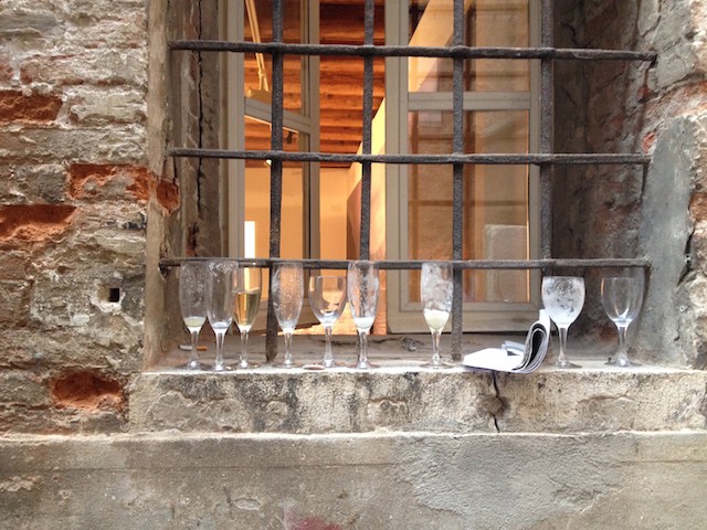
This year’s Architecture Biennale has received strong reviews. Yet when I was there, during the opening, few people — even the journalists — were actually paying attention to the exhibitions. Festivalgoers often seemed to breeze through an entire pavilion in two minutes. Nobody appeared to be reading anything. At first, I was indignant. Why bother coming? The free prosecco? Later, I became sympathetic. Later still, I became just like them. If you have an invitation to the opening, you have just three days to see the two main shows — one at the Arsenale and one at the Giardini — along with some sixty-odd national pavilions scattered around the city. Even seeing half of the Biennale in three days would be difficult. My girlfriend and I slogged through the big show at the Arsenale, Monditalia; breezed through parts of Rem Koolhaas’s show, Fundamentals, at the main Giardini pavilion, on our way to a magazine launch; and visited seventeen national pavilions, which had been tasked by Koolhaas with assessing modernism’s legacy. We zipped through the Canadian pavilion in about twenty seconds early one evening. “This looks good,” declared my girlfriend, “but boring. I need a drink.” We went to the Israeli pavilion for some prosecco. Then we hit up the Nordic pavilion for more. Then we bought some Aperol spritzes. Then we went home.

A few pavilions stood out. The Golden-Lion-winning Korean pavilion was engaging and thought-provoking, packed with maps, models, graphs, and films that probe the politics, geography, and architecture of the two Koreas. Though it didn’t offer a plan to reunite the nations, it did offer something constructive: a fresh perspective on Korea, a view of the peninsula not as a divided war zone but as a single nation. The Nordic pavilion, which highlighted Cold-War-era Scandinavian architecture in East Africa, and the Dutch pavilion, a retrospective on Jaap Bakema’s work and philosophy, were reminders of the ambition and optimism of postwar modernism — two things that are sorely lacking in architecture and public life in general today. And the Russian pavilion blew everything else out of the water. It’s a wildly inventive fairground that takes a better core idea than most pavilions — stripping Soviet modernism of its Communist stigma and revisiting it to look for contemporary applications — and presents it in an engaging, playful way.
But the captivating prose at Russia’s exhibition was an exception. Most of the Biennale was unambitious; some even seemed unfinished. At the Israeli pavilion, the wall text declared that Israeli cities are characterized by their hybrid of urban and suburban patterns; on the floor, robots doodled neighborhood plans and maps in giant sandboxes. No connection between the text and the robots was elaborated. The Spanish pavilion consisted of several rooms of attractive, large-format photographs of the interiors of contemporary Spanish buildings. The text introducing the exhibition was complete gibberish: three paragraphs of word salad about dialectical this, the vindication of that, and “maximized intensity.” What did it say about Spain, modernism, or architecture? Who knows? The German pavilion assembled elements of the Kanzlerbungalow — the old West German White House — without any clear context. I couldn’t tell you whether the architectural elements were replicas or whether the bungalow was disassembled and flown down from Bonn, to say nothing of what it was supposed to mean.
Typos abounded, and punctuation was frequently missing (sometimes literally: letters had fallen off the wall and, perhaps stuck to the bottom of somebody’s shoe, been carried away). The charming Danish exhibition, for instance, was marred by poorly edited wall text. One piece referred to the great Roman engineer and architect “Vitrovius.” This is something like a museum exhibit about baseball referring to Babe Roth or one about psychotherapy to “Sigmond Freud.” Problems like these characterized much of the Biennale. It wasn’t just quantitatively overwhelming — it was qualitatively underwhelming too. Nowhere was this more evident than at the British pavilion, a hazy exercise that pushed Byron, A Clockwork Orange, the London Blitz, and J. G. Ballard into the same frame, squinted at them, and, having nothing substantive to say, invited the visitor to connect the dots. “It doesn’t offer answers,” acknowledged the Guardian’s Rowan Moore in a glowing review, “but the questions it raises are pertinent. You couldn’t ask for more than this.” Can’t we? The leading questions raised by the British pavilion — isn’t modernism dead? hasn’t social housing failed? — are a tacit endorsement of the Tories’ agenda: burying the welfare state, leaving the poor to fend for themselves, and celebrating this neglect as “devolution of authority” and DIY-ism (Owen Hatherley, a staunch defender of modernism and public housing, left the curatorial team in March, citing differences of opinion).
The current fashion for disowning responsibility and social engagement, whether it comes cloaked in TED-born buzzwords or naked as the callousness of architecture’s Werner von Braun — “If it’s not on the blueprints, who cares where the slaves bleed? It’s not my department, says Zaha Hadid” — might help explain why the Biennale’s curators made such an inadequate effort to communicate their ideas, such as they are, to the public. This is unfortunate. Architecture is ever-present in our lives: everybody has an opinion about the new World Trade Center or the old Penn Station. Yet there’s little dialogue between the public and the architecture world.
Architecture’s largest and most public event needs to do more than just go through the motions. The Biennale, unfortunately, seemed to be driven not by passion or a desire to communicate, but by a sense of obligation. Every other year, it’s up to architects to fill the enormous yawning Arsenale galleries, regardless of whether anybody has worthwhile ideas to occupy them. Perhaps an ornamental city is simply an ill-omened venue for an event celebrating the most functional of arts. Venice may always be trapped in the past, but the Biennale should be at the forefront of a conversation about architecture’s future.
Michael Eisenbrey is a writer and editor in Berlin.
Top photo by author; bottom photo by Darrel Ronald
