Prussian Blue, The Color of Great Waves and Starry Nights
Cultural histories of unusual hues.
.
.
.
.
.
.
.
.
.
This is the story of a blue most common, and most beloved. A blue that Thoreau thought needed to be Americanized, like Freedom fries. It’s the color of waves and stamps and too many paintings to count. It’s an accidental pigment, a happenstance color, and an antidote for heavy metal poisoning. Meet my sweetheart, Prussian blue.
I’m so sorry you can’t see her properly, because she is beautiful. Unfortunately, like many high-chroma (i.e., high-intensity) pigments, Prussian blue can’t be accurately displayed on a computer. Screens emit too much light to properly showcase the texture and depth of Prussian blue, a hue that is both a color and a material. Darker than cobalt and moodier even than indigo (and with enough green that it sometimes reads as a dark teal), Prussian blue is often called the first modern pigment. (A quick note: pigments and dyes are not the same. According to Color Studies by Edith Anderson Feisner, a pigment is a “powder that are in a binder such as acrylic or oil which covers and adheres to a surface. Dyes are pigments that are dissolved and absorbed in a fluid.”) The microcrystalline blue powder has been around since 1705. Its invention was, like penicillin and saccharin, the product of happenstance.
The story goes like this: in the early years of the eighteenth century, alchemist and avid dissector Johann Conrad Dippel (who is rumored to have been the inspiration for Mary Shelley’s Frankenstein) was sharing a lab in Berlin with Swiss pigment maker Johann Jacob Diesbach. One day, Diesbach was working on a batch of cochineal (a brilliant red dye made from crushed insects) when he used a tainted instrument from Dippel’s table to mix his crimson brew. Dippel had been working to invent a recipe for immortality, but instead he created Dippel’s oil, an awful-smelling mixture made of crushed animal bones (sometimes also called “bone oil” or “animal oil” or “bone sauce”) that would eventually be used as a chemical weapon during World War II. When Diesbach grabbed Dippel’s oil-coated instrument and plunged it into his vat of red dye, he had no clue he was about to create an entirely new (and highly profitable) color.
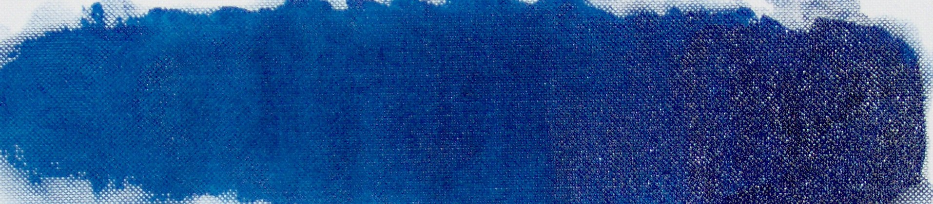
Image: Wikimedia Commons
The two Johanns discovered the blue pigment the following day. “The immense value of the substance was immediately clear,” writes historian Hugh Davies. At the time, paints were expensive and many colors weren’t readily available. Certain hues were difficult to manufacture, while others didn’t last long on the canvas without fading or mutating into some other, less desirable hue. Bright, true blue, in particular, was difficult to find. “The recipe of Egyptian blue used by the Romans had been lost to history some time in the middle ages,” Davies explains. In lieu of that blue, artists had been using lapis lazuli imported from Afghanistan, which was wildly expensive. “So the discovery of a stable blue color was literally more valuable than gold,” Davies explains.
This was a time when European attitudes towards blue were shifting. After years of red and black dominance in early religious art, people were slowly warming up to the cool tone. “In early Christianity, red was the dominant color,” explains Rhona MacBeth in Blue: Cobalt to Cerulean in Art and Culture. Red was the color of saints (hence the term “red letter days”) and black was seen as somber and sacred, suitable for important religious figures. “Blue also benefited from its close association with black,” MacBeth writes. By the dawn of the eighteenth century, “Blue’s status as a color of consequence was now irrevocable. But even though the its status was accepted by the church, by royalty, and by men of science, the deep purple-blue of ultramarine remained a luxury item for painters.” The cheap and easy to produce compound couldn’t have entered the scene at a more fortuitous time. Diesbach began profiting off of his discovery almost immediately, and he soon was shipping the new blue paint all over the place, from France to Japan to China to Prussia. The color made its way onto wallpaper, stamps, flags, and paintings. In 1709, the compound became the official uniform color of the Prussian army, thus earning it the name “Prussian blue.”

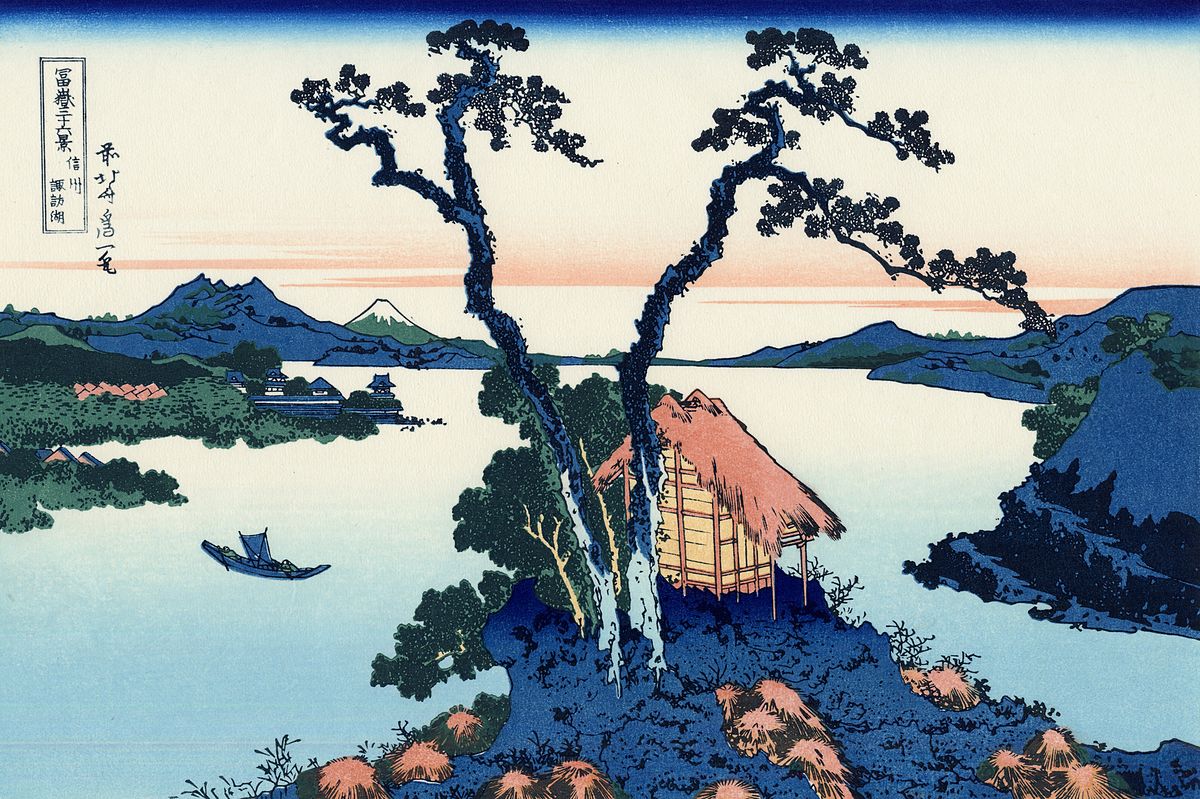
By Katsushika Hokusai – Tokyo Fuji Art Museum, Public Domain, Link
Europeans weren’t the only ones feeling thirsty for blue (sometimes literally—the Prussian blue pigment even made its way into English teacups). The color became incredibly popular with Japanese printmakers in the late Edo period, and Katsushika Hokusai, creator of some of the most easily recognizable works of Japanese art, led the way. He used it throughout his series “Thirty Six Views of Mount Fuji,” and Prussian blue plays a particularly dramatic role in his iconic print, “The great wave off Kanagawa” (1832). Hokusai chose Prussian blue to color his ocean (it is the only bright color in the work), creating saturated swells that contrast with the white crest of foam in the foreground and the diminutive blue peak of Mount Fuji in the background. Davies traces how this pigment went from Europe to Japan and back again, as European artists were caught up in the “Japonism” craze. Believing this blue was emblematic of Japanese art (when it was, in fact, a European invention) painters like Monet and Van Gogh began to deck their canvases with Prussian blue paint. They even took to calling this novel color “Hiroshige blue.” Some art historians believe that Van Gogh’s most famous painting was a direct response to Hokusai’s work. In 1889, he painted Starry Night, a masterpiece that “owes everything to Hokusai’s blue wave from its color to the shape of its sky,” according to Davies.
By Katsushika Hokusai – http://visipix.com/index.htm, Public Domain, Link
Americans dug this deep blue, too. John Audubon used Prussian blue paint in his Birds of America series to capture the brilliant feathers of magpies and blue jays, and Winslow Homer used it to depict the tropical ocean in his late career watercolors. But some people felt that they should come up with their own name for the pretty hue. Big complainer and faux-homesteader Henry David Thoreau wrote in his 1862 essay “Autumnal Tints” that he thought we should find a more American name for certain foreign-born colors:
Shall the names of so many of our colors continue to be derived from those of obscure foreign localities, as Naples yellow, Prussian blue, raw Sienna, burnt Umber, Gamboge?—(surely the Tyrian purple must have faded by this time)—or from comparatively trivial articles of commerce,—chocolate, lemon, coffee, cinnamon, claret?—(shall we compare our Hickory to a lemon, or a lemon to a Hickory?)—or from ores and oxides which few ever see? Shall we so often, when describing to our neighbors the color of something we have seen, refer them, not to some natural object in our neighbor hood, but perchance to a bit of earth fetched from the other side of the planet, which possibly they may find at the apothecary’s, but which probably neither they nor we ever saw? Have we not an earth under our feet,—ay, and a sky over our heads? Or is the last all ultramarine? What do we know of sapphire, amethyst, emerald, ruby, amber, and the like, most of us who take these names in vain? Leave these precious words to cabinet-keepers, virtuosos, and maids-of-honor,—to the Nahobs, Begums, and Chobdars of Hindostan, or wherever else. I do not see why, since America and her autumn woods have been discovered, our leaves should not compete with the precious stones in giving names to colors; and, indeed, I believe that in course of time the names of some of our trees and shrubs, as well as flowers, will get into our popular chromatic nomenclature.
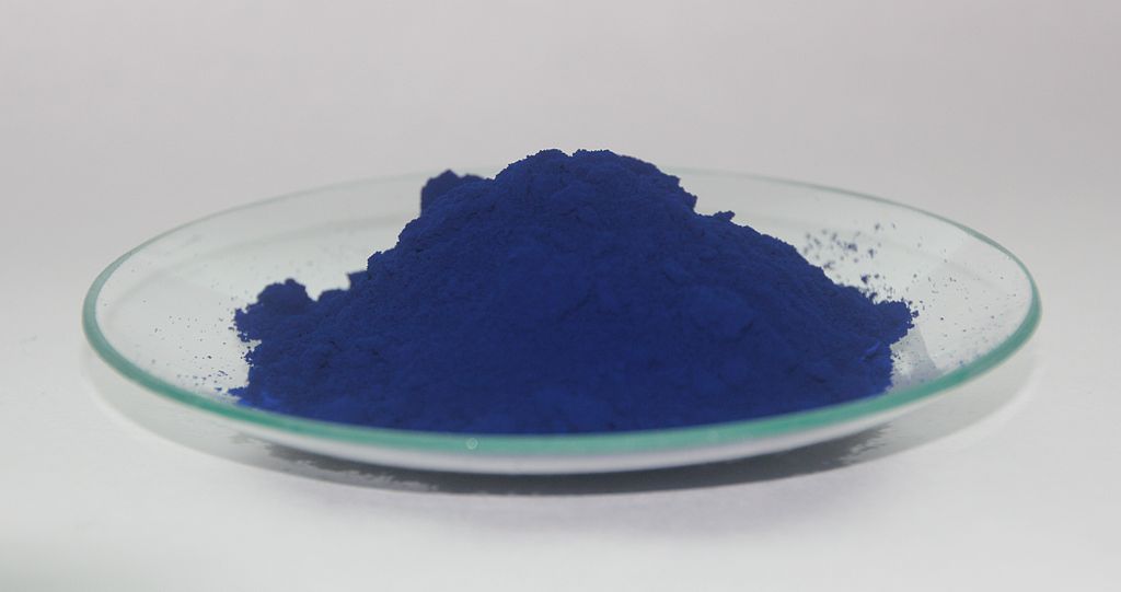
Image: Wikimedia Commons
While I appreciate the phrase “popular chromatic nomenclature” for its delicious mouthfullyness, I can’t say I agree with Thoreau. No one, not an American literary great, nor a couple of dimwitted tweenage Nazis can ruin Prussian blue for me. It’s got such a sexy vibe. Plus, who are we to strip this pigment of its Central European heritage? (Similarly, I don’t believe in changing dog’s names, which is why my dog has a dumb name. Sorry, Deja.)
It may seem as though I’ve already lost this battle. While the pigment is still referred to as Prussian blue by chemists and doctors, who use pills filled with the pigment to safely counteract heavy metal poisoning, major players in the color appellation game have switched to other, less foreign names for the color. In 1958, Crayola changed the name of their blue crayon from Prussian Blue to Midnight Blue for reasons unknown. (Some sources say it was because they didn’t think anyone remembered Prussia anymore, while others—like Uncle John’s Bathroom Reader—say it was a reaction to the Cold War.) And Pantone doesn’t have a Prussian blue in their swatch box. (I’ve reached out to Pantone to explain this oversight and I have yet to hear back.)
But I’m not quite willing to concede the superiority of American-named colors just yet. In July 2016, Crayola offered up naming rights for one of their blue crayons in an online contest (they awarded daily prizes to voters, and one lucky voter got the “grand prize of a four-person trip to the Crayola Experience attraction in Orlando,” according to CNN). The color is lighter than Prussian blue—more of an electric blue, really—and the company decided to let the masses choose from four possible names. And what did they go with? The thoroughly unromantic and unappealing portmanteau “Bluetiful.” Somehow, I doubt Thoreau would approve.