Whither The Webpage
Does it even matter what a website looks like anymore?
It only happens from time to time, but even today one will, on occasion, find oneself on a webpage. An honest-to-God site. It can be a disorienting experience. Where is the home button? Where is the hamburger menu? Where is my profile picture, and chat box, and why are the links broken, and why does this all load so slowly?
Chances are good you’re reading this particular piece of content on your phone, through a smoothly-loading feed. That’s okay! This is neither quantitatively unusual nor qualitatively bad, it’s simply the way things are. It’s now well established that most internet users experience the web through a handful of large, enclosed platforms and apps. We’re fast moving toward a majority of Americans getting their news exclusively through a Facebook feed. (Or maybe not!)
If the internet is trending toward commercial consolidation and monopoly, it shouldn’t really surprise us that this would also mean a monopolization of its affect, its look and feel, too. It’s no wonder websites look the same now; they essentially are the same thing.
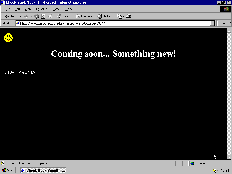
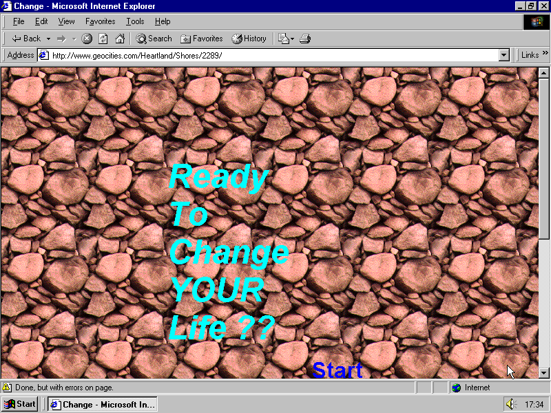
Was the Early Web any better? The pre-platform, pre-mobile internet was a web of pages and links and counters. The most essential thing about it is the notion that it looked bad. But the bad-looking web is making a comeback. All of a sudden you’re on that clunky-looking webpage again.
A recent Washington Post piece focused on one Swiss designer’s designation for the bad web renaissance: “Web Brutalism.” Pascal Deville collects examples of web brutalism on brutalistwebsites.com, itself a kind of brutalist template, which highlights some of the web’s best worst design.
As with brutalism in architecture, these sites use their infrastructure as a design element. Some, like Bloomberg Businessweek, are the product of extremely web and art-conscious designers. Others, like Drudge Report, are kind of outsider brutalists — the Paranoid Crank Style in American Web Design.
That anyone still bothers to build homepages at all should be heartening, when it’s both easier and almost surely more financially rewarding to post something directly to a social network. But from a design standpoint, all web brutalism seems to mean is a turn away from the affective onslaught of the gooey, bubbly skeuomorphism of Web 2.0., and a rejection of the streamlined, blue superflatness of the Zuckerbergian web, in turn. Deville’s examples of web brutalism run from the Geocities-adjacent to weird little single-servings to meta jokes to Craigslist.
So while web brutalism might not refer to any one specific design aesthetic, it still seems to pick out a certain kind of website, not a look so much as a feel. Web brutalism might even be an important way to conceptualize the internet. Why not? Independent web publishing (ahem) is still important, and its operation separate of larger commercial interests becomes even more important in our contemporary Hogan-Thielscape.

A few smart people saw it coming. Steph Davidson is an artist and designer at Bloomberg Digital. She is a prolific maker of websites. Davidson and the Bloomberg team are responsible for the consistently great and weird design of the print Businessweek, as well as its web features. It has always seemed both fitting and unlikely that late capitalism’s trade mag would so often look like an elaborate Dada prank.
Businessweek’s design might seem like proof that web brutalism has arrived in the mainstream. But Davidson doesn’t put much faith in the phenomenon, at least not as it exists in Deville’s world. In an email, she wrote, “I don’t think web brutalism exists…A lot of this style comes from net art, sites from 8 or 10 years ago, like paper rad, google with 53 o’s, rhizome, maximum sorrow, spirit surfers, nasty nets, tumblr and so on.”
aesthetics is a prison
So to what extent does the way a site looks impact what a site is? This question might have to be re-legislated again. What seems certain is that fewer discrete pages means fewer discrete voices, and further ensures that the internet becomes primarily a vehicle for reaction (and all the ugliness of a purely reactionary culture) rather than creation.
Nostalgia for the way the web looked is really a sublimated nostalgia for how it felt, for a time in almost everyone’s life when discovery and openness and joy were all more operable. As much as we want to preserve the early internet in amber, we want to hold on to the feeling of the early internet even more.

The web has a kind of archive fever recently. Contemporary projects like Deville’s site, GeoCities Forever, One Terabyte of Kilobyte Age, or Web Safe 2K16 are, in very different ways, creating web archives of affect. The bad-looking web was also the earnest-feeling web. A strong undercurrent of fandom and eagerness and joie de vivre sustained it. Internet “maker culture” promised to efface geographic and demographic identity in favor of affinity. Whether you were a collector of vintage gardening equipment or an amateur whittler or a Roswell conspiracy theorist — the web would, the idea was, allow for your flourishing, and the primacy of hobbyists, enthusiasts, autodidacts.
The appeal of the hand-made webpage remains its openness to whatever niche, obscure hobby or interest you might have. “The fact remains: Anyone can create a home page!” Paul Ford, a writer and technologist, told me in an email. “God please show me more home pages with goofy graphics from strangers instead of random Facebook updates,” he wrote.
As the investor class pivots toward video, the web actually stands a decent chance of becoming more disjointed and oddball and ecumenical in its design, and in turn more spontaneous or creative in its spirit. A closer visual link to ordinary, lived reality has some promise. Perhaps life on the internet will better resemble the dizzy phantasmagoria of life in a physical reality. A live stream is less curated, more amenable to chance and contingency.
But! It also stands to replicate the worst aspects of television: passivity, mediocrity, a plurality of superficial choice with the same indistinguishable affect. Not to mention new sorts of vacuity and horror specific to a post-platform age. I don’t know a lot about virtual reality, but I’m told to prepare myself not for ads but for “branded experiences.”
The television model puts a premium on persona over personhood and the old complaints become new again (get ready to say that you don’t even own a streaming service subscription). An internet premised on the stream will probably prompt new forms of nostalgia: to just explain oneself in writing for once, in a multi-paragraph Facebook update, like the good old days. Either the coming video model finally calls the internet’s democratic bluff, or it ushers in a brave new era of millennial Vine-celebrities in the House of Representatives, gleefully rebuilding a social democratic welfare state, passing sane gun control legislation, and breaking up the banks while GoProing their water-bottle flips.
Ford and his colleague Rich Ziade theorized on their podcast that hand-coded, early web technology may someday work like organic food, earning a little USDA certification label. Users, the idea goes, have a right to know what they’re getting themselves into. Platforms and feeds don’t do much to distinguish between reported news items, recycled memes, “Epic Rants,” and branded, commercial content—publishers themselves hardly seem to make an effort. A (non-premium) cable television analogy might also be helpful here: as long as we’ve declared high-speed internet a public utility, we might as well insist on a C-SPAN.
Charles Thaxton is a web producer at JSTOR Daily and a freelancer elsewhere. He’s on Twitter @thaxromana.