The Genuine Article
Alexis Lloyd at the Times R&D; lab states clearly something others have been futzing around with for a while:
In May of this year, Facebook announced Facebook Instant Articles, its foray into innovating the Facebook user experience around news reading. A month later, Apple introduced their own take with their Apple News app, which allows “stories to be specially formatted to look and feel like articles taken from publishers’ websites while still living inside Apple’s app”. There has been plenty of discussion about what these moves mean for the future of platforms and their relationship with publishers. But platform discussions aside, let’s examine a fundamental assumption being made here: both Facebook and Apple, who arguably have a huge amount of power to shape what the future of news looks like, have chosen to focus on a future that takes the shape of an article. The form and structure of how news is distributed hasn’t been questioned, even though that form was largely developed in response to the constraints of print (and early web) media.
People tend to shrug off assertions like this — “The Future Of News Is Not An Article” — for being too broad or too obvious or for lacking practical recommendations. (Or for containing the actual phrase “future of news.”) But Lloyd’s post is a set of observations paired with a set of practical, institution-specific proposals. Read it!
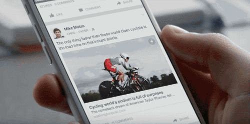
Now that Instant Articles are more fully rolled out, and everyone can see them for themselves, I wonder if their formal dimensions will start to seem odd to people. Or… strained? In the run-up, Facebook explained Instant Articles as a way to solve a particular problem: articles, which came from websites, were widely shared and read but loaded slowly. This was a tech issue, simply solved, with some additional obvious consequences: Facebook assuming control over layout; Facebook either influencing or participating with publishers’ advertising and revenue plans in a direct way; Facebook entering into more formal relationships with publications that had previously treated it as an open space in which to experiment. From the user’s view, these articles really do feel like part of their phone’s software — they look and behave like parts of the Facebook app, like pure units of Facebook content. But fixing those issues allows readers to focus on new ones: Why, aside from momentum and expectation, should this native Facebook content look and feel like faster, smoother website content? Why is it still structured like a news article from a newspaper? Why must it have, for example, a headline and a “dek?” Why is the byline where it is? Why does it still open in a new frame?
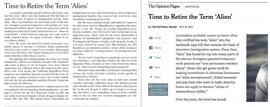
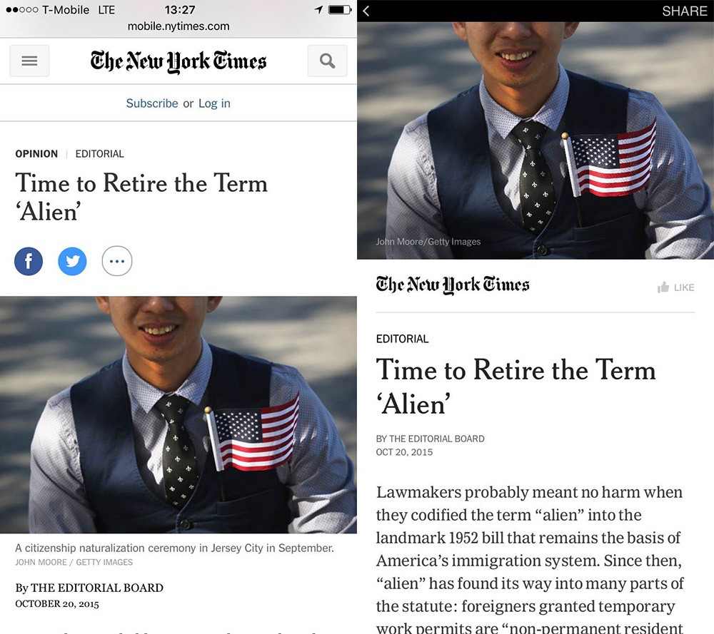
For most readers these questions won’t manifest explicitly, but rather as small contrasts suddenly made more obvious: When you tap an article, you are taken to a page that is, unlike virtually any other screen on Facebook, mostly stripped of buttons and interactivity and interface. It exists outside the narrative and context of the feed but lacks any context or cues to explain or excuse its own suddenly stark quirks. A straightforward inverted-pyramid news article, written in a conventional tone and adhering to a familiar newspaper or magazine structure, feels, as an Instant Article, a bit like a news clipping pasted to a wall. It is technologically native but formally foreign; recognizable and easy to process but clearly removed from its original context. Here’s a single piece in four very different contexts: a paper page, a browser, a mobile device, Facebook.
Print and web:
Phone web and Instant:
This question — what should an article look like in the context of a cascading feed of stuff? — has been lurking below the surface for a while, and lots of people have been thinking about it. That a link would take someone out of their feeds, and into a big messy website, where website conventions — still largely derived from print conventions — meant that these questions weren’t so urgent. But absent that wait, the page-load, the navigation bar, the benefit of years of internalized expectations about where and why particular forms of writing exist, and the subtly transporting experience of watching an external publication gradually piece itself together in a slow pop-up browser, a straightforward news article seems as formally contrived as it actually is.
If Facebook has been focused on solving a narrow tech problem, and advancing its own advertising interests in the process, publishers have been focused, throughout the Instant Articles development and rollout, on maintaining some semblance of control and familiarity. (Or, in a more anxious formulation, on preventing Facebook from absorbing most of their more obvious utility and value.) Both sides were incentivized, then, to create what they did: A faster version of the things publishers were creating in the context of their sites, magazines and papers — things that people were sharing and reading and spending a great deal of time with. But it’s possible this has resulted in the codification, in Facebook’s platform, of a fairly conservative idea of what a news or entertainment organization’s output should look like. It’s in the name! In this view, the advantages gained by partners publishing to Instant are more limited in scope: Your native article, which loads in a faster external frame, will look and perform and likely share better than the linked article that loads in a slower external frame. It has an explicit advantage over links; it is still, as something that takes you out of the flow — unlike, say, a video — at an article-like disadvantage to everything else in the feed. (Among the formal changes made for video in the feed: auto-play, no sound.)
So, a thought experiment! Now, tapping an Instant Article sends you to a separate full-screen page. This is what everyone asked for; this is what we got. But imagine an “article” that just expands in the feed, vertically. What would that look like? What is the feed analog to a post or an article? If it had a headline, would it remotely resemble the types we put on current article pages? The curiosity gap wouldn’t make sense here, for example. But what would? Would the article just start? Would it assume the native Facebook language of the Personal Update? Or would it demand a more thorough kind of preview — a pre-article that could be scanned and either expanded or not? If conventional articles followed from the demands of a newspaper’s layout, then what does a feed-native article look like? Which ones would disappear seamlessly into the feed, perhaps shorter or written in a different style or tone, as their context demands? And which ones would still feel most at home loading separately, in contexts of their own making? The more aggressive approaches to Instant have focused on longer stories, or stories constructed as, like, deluxe interactive slideshows — things that are either meant to stand without much context or that play explicitly with the context and tech of Instant. These are most like the things Facebook envisions in its launch video: big interactive video/text/map/gallery installations; things that explicitly couldn’t exist in the feed. But what about the articles that mostly could? Twitter: SAME QUESTION. There’s also the matter of distribution: Instant Articles are a concept that follows from previous publisher habits — a more thorough extension of the idea might end with some sort of non-feed curation, or a publication-like organizational structure within Facebook, outside the flow, which is kind of what they’re already doing with videos. But why would Facebook reverse engineer the websites it’s replacing? Why not let post types follow from the feed, rather than the other way around? (Lloyd, in her post, goes a step further, trying to find something like the essence of an article, by breaking it down into components. In that sense hers is a bigger project.)
Anyway. No rest for the weary! And maybe the best answer, because who says News Feed has to favor everything equally, is mostly just video.