Today's Internet Is Tomorrow's Aesthetic

Ever see a crazy-long, indecipherable reblog chain on your dashboard? Not ideal, right?
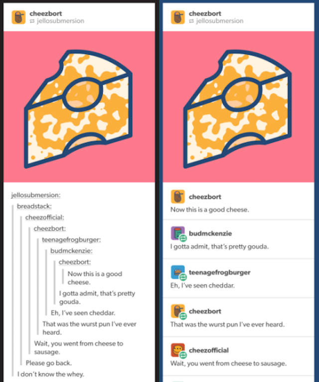
Starting tomorrow, reblogs will have a new look — one that showcases all comments as equals, not buried under an impossible stack of blockquote indents. Our change to reblog captions last month laid the necessary groundwork for us to arrive here, at a place where the dashboard will be a lot easier to read and cleaner-looking.
Remember reblogs? Those big long chains of names, and sometimes words? Remember looking at Tumblr for hours and days and months before ever quite figuring out which way the word-stairs led? Remember trying to figure out where to submit YOUR little words, and in what format, and, wait, what are people going to see when I post this, exactly? And who’s going to see it?
Remember text boxes that you would fill with text that might surprise you when it came out the other side? Remember Tumblr blog designs? Oh my god. Remember Tumblr blog designs?
Remember scrolling and THEN reading? With a mouse? Remember rubbing your touchpad down and the stuff on the screen moved up? Remember the funny cursors sometimes? Remember the ‘next’ button and the ‘previous’ button and remember not remembering which one was which?
Remember remember the 90s in 2013? Remember remember remember.
In 2018, a twelve-year-old girl finds a picture of a laptop computer with Tumblr on the screen. The post is a rotating gif of the word “memes,” set inside an old browser with a back button. The reply chain gets so skinny you can barely read it.
She nearly cracks a smile, then posts the picture to her Tumblr app without comment. 7,000 reblogs.
