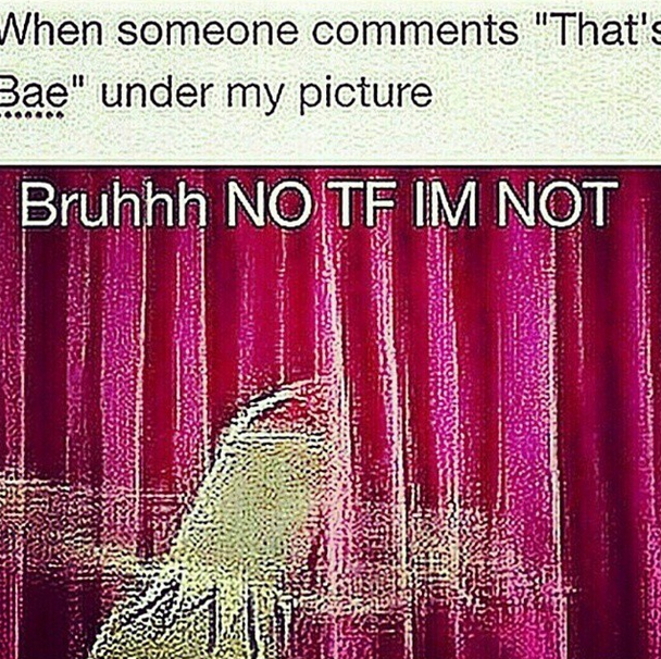
The Triumphant Rise of the Shitpic
by Brian Feldman

In the first chapter of his book, After Photography, digital photography theorist Fred Ritchin explains the central selling point of digital over analog:
Digital is based on an architecture of infinitely repeatable abstractions in which the original and its copy are the same; analog ages and rots, diminishing over generations, changing its sound, its look, its smell. In the analog world the photograph of the photograph is always one generation removed, fuzzier, not the same; the digital copy of the digital photograph is indistinguishable so that “original” loses its meaning.
Put differently, the common perception is that digital files can’t decay. The grooves in a record are eventually worn down by the needle, while an MP3 file retains its data structure. If you open a JPEG today and then again 20 years down the line, the photo will not have changed at all; it won’t have yellowed or faded or have developed frayed edges. This guarantee of digital preservation is why I spent hours scanning family photos at high resolutions and transferring home movies from 8mm magnetic tape onto a hard drive for my parents. When you transmute something into digital, the assumption is that you preserve its fidelity forever.
Ritchin first published After Photography in 1999. Digital photography was becoming more popular, but we hadn’t yet started to put all of our photographs online. Since then, as files are put through a myriad of compression algorithms and Instagram filters, a new aesthetic of digital decay has started to emerge.
Let’s call them Shitpics. Because they look like shit.
Shitpics happen when an image is put through some diabolical combination of uploading, screencapping, filtering, cropping, and reuploading. They are particularly popular on Instagram.
For instance, consider this post by the very famous celebrity Ludacris.
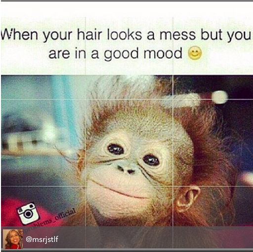
There’s a lot going on here. Let’s try and figure out how this image ended up in its current state.
The image was probably created by the joke account @blackgirlproblems_official, where it looked like this:
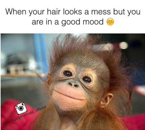
There are a few clues that this is probably the original. The text is centered and sharper, and the emoji is more than a smudge of dirty yellow gibberish. The picture of the monkey is clear (and cute!!!). All of the text in the watermark is legible.
Then this meme went through hell.
It was saved and cropped numerous times. There are a few signifiers of this: The text is cut off on the left side and there are slight black bars at the top and bottom of the frame. The greenish cloud around the text also indicates an absurd amount of (re)compression.
Maybe the most baffling part of this is the appearance of the rule-of-thirds grid, which likely came from Instagram’s upload screen. Which means that someone screencapped their upload process and then uploaded that? And the grid somehow doesn’t even reach the top and bottom edges.
The version of this image from @msrjstlf indicates that it was probably not run through a filter at any point, since the whitespace seems to have stayed mostly that. The lower left corner of the picture does show, however, just how many times it has been reconfigured: the “black” in “blackgirlproblems_official” has been absorbed by section of blanket that has been widening and darkening as the macro travels through the wringer.
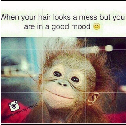
Then Ludacris puts the cherry on top: a translucent gray regram banner crediting the account that he got it from (though not, of course, the original photographer or even macro author).
The Shitpic aesthetic has arisen from two separate though equally influential factors, both of which necessitate screencapping instead of direct downloading. The first is that Instagram, which has no built-in reposting function, doesn’t let users save images directly. This means that the quickest way to save an image on a phone is to screencap it, technically creating a new image.
The second, more important shift is the new macro format that divorces text from image. Classic memes (jfc “classic memes” what are we doing) had text directly on the image, written in Impact font in a particular style — white with a black border. That changed with the rise of the text setup/image punchline format on Tumblr, particularly on the blog What Should We Call Me, which spawned and continues to spawn imitators. Twitter began to imitate this when it changed tweet formatting to hide image URLs (pic.twitter.com) from tweets, easing the transition from text to image, from setup to punchline.
It’s difficult to send someone a technically exact copy of these types of jokes, because they can’t be bundled into a single file such an image. Sending the URL where the joke is hosted requires someone to load an entire webpage, which is relatively laborious on mobile, and so they necessitate being screencapped.
In general, directly saving images on mobile is a function that, even when available, most people don’t bother to use or even learn (saving files locally — in any kind of file system — is generally discouraged in smartphone operating systems). Screencapping is just easier — it’s the quickest way to get something from the internet to your camera roll. That’s why even classic-format memes have fallen victim to the Shitpic process.

People have an excuse for everything #gymratprobs pic.twitter.com/2mjnYBNvz5
— Gym Rat Problems (@Gymratprobs) November 15, 2014
When you pair the format’s inherent need to be screencapped in order to attain virality with Instagram’s prevention of downloading images, you get an endless cycle of screencapping and compression through uploading. Throw in the occasional filter, or watermark, or regram tag, and let the process carry itself out for a while, and eventually you get a Shitpic. The layers pile up, burying and distorting the original.
The rise of the Shitpic demonstrates just how little ownership there is on the internet: Shoddy workarounds and subpar image quality are a small sacrifice to make, so long as your version of a joke goes viral instead of someone else’s. That the image is a muddled cacophony of compression artifacts and blurry emoji matters little, so long as your screenname is above it.

Perhaps most importantly, the Shitpic aesthetic could very well be the first non-numeric indicator of viral dissemination. Metrics such as pageviews, impressions, Facebook referrals, YouTube view counts, and BuzzFeed viral lift all attempt to quantify virality in some way. To the layman (and, let’s be frank, some industry experts too) all of this is gibberish.

But if you look at a Shitpic, you can instantly tell the level of virality by how worn it looks, how legible its text is, how many watermarks adorn it. You can count them much like you would rings on a tree. A pristine-looking meme engenders skepticism — “This can’t be that funny, it hasn’t been imperfectly replicated enough.” But when you see that blurry text, partially cut off by the top of the frame, and a heavily compressed picture of Kermit below… that’s when you know:
This is gonna be a good-ass meme.
