Cover Stories
Cover Stories

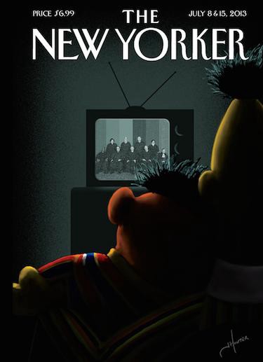
The other day, the New York Times observed that there has been “a shift in The New Yorker’s cover art toward the topical and provocative.” One can see that change, literally, where, “at The New Yorker’s Midtown offices, a wall of covers arranged in chronological order shows a distinct change in tone,” with a turning point being somewhere “around Sept. 11, 2001,” when it ran a stark, all-black cover.
This is largely in tune with a shift in the tone of the magazine itself, which has grown only more responsive to current events in recent years (in contrast to its stance under every editor that preceded Tina Brown in 1992). But there’s another value in producing provocative covers, one scarcely implied by the piece’s author, Ravi Somaiya, who notes that “a number of The New Yorker’s covers have made headlines of their own.” And while that is literally true, particularly in the instance of the provocative Obama fist-bump cover, a webbier way of saying this is that these kinds of covers have a tendency to go viral. While they are not expressly made for the web or to go viral — the art editor Françoise Mouly, was hired in 1992, by Brown — the medium of cover art might as well be tailor-made for spreading and commenting: Covers require little investment from viewers (who perhaps already have some image of the New Yorker in mind even when they arrive, even if they never manage to actually read it), far less than articles, in order to engage with a cover — and share it. It’s the only New Yorker form more web-native than cartoons, particularly in the increasingly image-driven sharing economy (despite how much media people loooove talking about Long Things). And it works.
The New Yorker is clearly not unaware of the medium’s inherent suitability for the web and its ability to generate traffic on its own; Somaiya’s piece is pegged in part to a stunt cover, its first-ever animated GIF “cover” of a rainy day (which, in its selective focus, is itself a depiction that utilizes well-worn Instagram trope) that can obviously only be viewed on a screen. But the potential for these kinds of covers to go viral in and of themselves is based in large part on a form of novelty that is heavily grounded in the context of being a New Yorker cover — and not necessarily the statement itself. If novelty and/or shock is the fuel that powers the engine of these covers’ virality, the obvious questions, which may be unfair, are how inexhaustible that supply is and how much of it will the New Yorker tap; the magazine has been extremely judicious in its deployment of truly jarring covers, and it also has more capital to start with than other publications who were then far less prudent about what they put on their covers.
IDK, whatever, I like the new covers.
