The Infographics Have Turned on Us

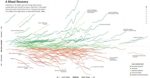
Nearly everything about The Upshot’s new infographic blockbuster, “How the Recession Reshaped the Economy, in 255 Charts” is grim: Your industry is probably doomed — vocational rehabilitation services, a seemingly highly relevant field in this post-recession, godforsaken labor market, has not recovered — unless you make apps, or wrench natural resources out of our deteriorating planet in order to power the computers on which the apps are made, or you sell truffle-laced chocolate bars to the people making the apps, or brown liquor to the people who aren’t making the apps and trying to get by, perhaps a construction worker or a print journalist or a factory worker. There are two hundred and fifty-five fully interactive charts to tell you this, to overwhelm you with these facts. You could look at one of these charts a day for the next six months and you would still not comprehend the full sweep of its gloom. In fact, if you aren’t in a field where you can afford a computer built in the last six months, you probably can’t even read this beautiful compendium of dire labor prophecies, because it’s so packed with code and graphics and animation by the highly employable data visualization wizards at the Times that your machine can’t even handle it. And if your computer can’t handle it, can you?
