What Do The Apps Want From Us?
App updates seem to come in waves. One minute you’ve obsessively completed updates, the next minute, your folder or app store icon on your phone has a big red “22” badge on it. Around half of all updates are minor but useful bug fixes. Sometimes they’re incredibly undersold security updates, a little trick Tumblr pulled this week when they realized that they were sending passwords in plain text. (No one really went crazy about this, surprisingly, because we live in password denial: “Some company that you exchange information with is going to reveal your password to someone else.”) This week’s app updates cluster revealed something more interesting: lots of what look like developer’s pet projects, lots of weird iteration, and lots of things that most users just don’t care about. But underlying these updates is an industry-wide desperation to scale, to be beloved. The apps want you to live in them. They want you to get your friends to live there with you. They want you to spend all the time with them. That’s why the only real update for a game app is “hello, we just added 100 new levels to Candy Crush” or the like. That’s what users want, and that’s what they should get.
Developers and the companies they work for live in a funny box. They get user feedback from superusers and from loud users, and they get raw data, but they’re also subject to internal roadmap obsessions. When that happens, they roll out crap that no one wants. At larger companies, like Google, mistakes get made when other products inside the company have to get shoved inside a perfectly good standalone product. This is becoming a hallmark of Google’s greatest failing. (See also: making “chats” into “hangouts” and pretty much literally everything involving Google Plus.) Of course, Google’s real greatest failing is that maybe it is becoming a cult?
In any event: There’s two ways to get users to live in your app. You can give users a surprise they might like — or you can give people something they really did want. Sometimes people don’t actually like doing the latter: it’s like asking your kids what they want for Christmas. But surprises, as with gifts, often looks like flailing. It’s iteration as “throwing shit at the wall” to see how users respond.
Let’s start with some of the good app updates of the last ten days, from some of the largest companies in the market, and work our way down to some of the most horrible things ever seen in the history of mobile.
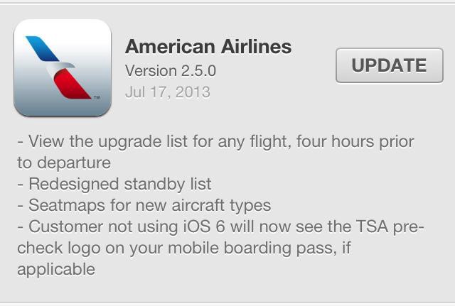
American Airlines
American Airlines has suffered on the web for a long time, and finally made their way through a web redesign that was mostly good (and desperately needed); likewise, their app has come a long way. That they actually managed to wrangle the systems to show flights’ upgrade lists and TSA pre-check boarding status in the app is an huge achievement. This is amazingly impressive. They gave us all a thing we want but didn’t even believe we could ask for.
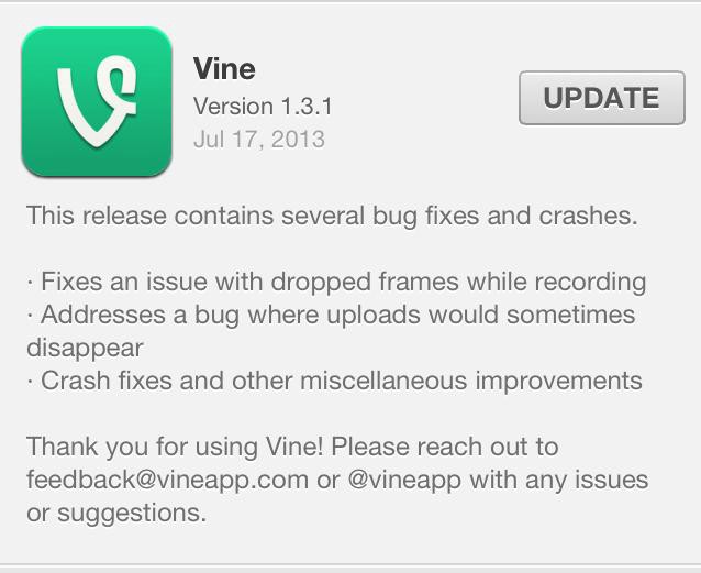
Vine
A solid update, that promises to deliver better performance. This gives a soothing feeling: an update that says “we will end your frustrations with using our product” is wonderful.
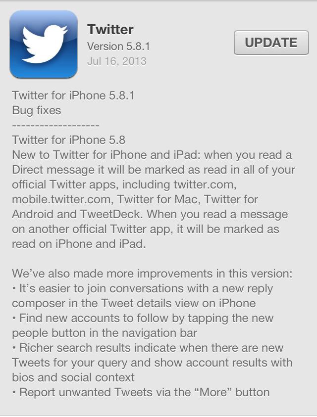
This is basically an interface change, which, eh. No one likes constant change. One of the hallmarks with our frustration with web and mobile products is constant shuffling and changing of features. Their search result changes aren’t actually an improvement, but, again, eh!
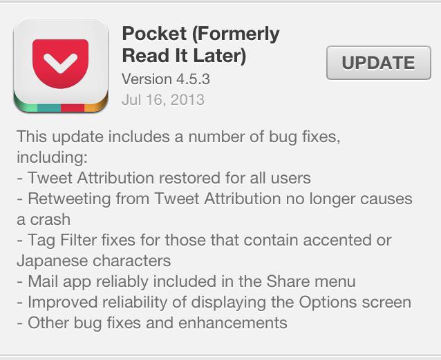
Reliability and reliably! Plus the servicing of a language-specific problem. Sweet.
GroupMe
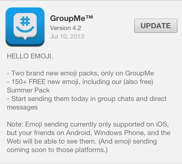
This is where things start to get hairy. GroupMe, owned by Skype which then went under the Microsoft umbrella, is a funny critter. This update services a younger segment of its audience, presumably. It’s pretty daring to issue an iOS-only non-necessary feature though!
Google Maps
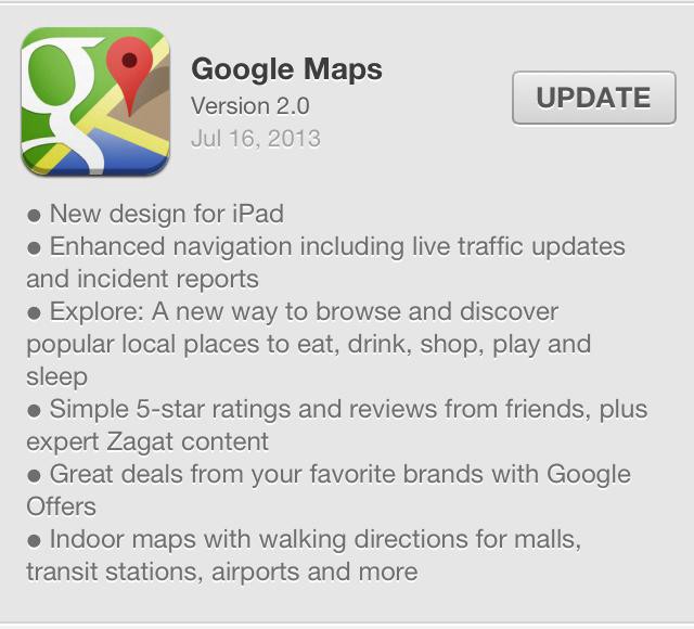
Possibly one of the shittiest app updates so far in human history. What do people want from Google Maps? They want to be able to get places, and also to get there well. Google Maps is an extremely crucial invention, and unlike many apps, it services a diverse user base: rural people, city people, public transportation users, drivers alike. What they’re doing now is PILING GARBAGE INTO IT. Zagat is a useless database of crap. “Great deals from my favorite brands” is a heap of shit, and it’s actually a lie: I highly doubt I will hear from my favorite brands through Google Maps. “Indoor maps” could be intriguing. All I really want though is for Maps to learn where the subway entrances actually are. Not so hard. Finally, everyone is pushing “discovery” and “exploration,” and mostly everyone is failing at it.
Almost as bad, though not as undermining: Facebook rolls out verification. They just couldn’t help stealing this from Twitter. This rolled out in late May online; weird that it took them until July 10th to get to mobile.
Cinemagram
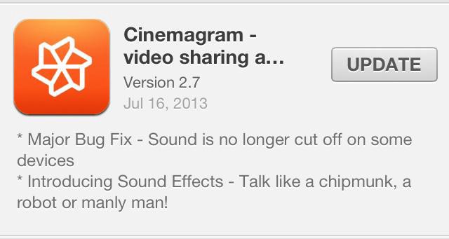
I’ve felt a lot of time feeling bad for Cinemagram in the age of Vine. It’s a great product, particularly with the updates it’s received in the last year! In many ways it’s better than Vine. It is, I think, also far more global. Focusing on delivering updates like sound effects (talk like a chipmunk??? Or… a manly man?) seem… off-base.
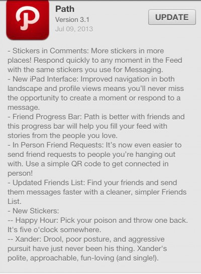
Path
The most beloved-by-indielectuals app of them all, Path, got a freakishly weird and almost unintelligible update on July 9th. Use… a QR code to friend people IRL? Friend Progress Bar? New… Stickers? Exactly what the fuck is going on here? Honestly, I get the love for Path, and it’s a delightful creation, but this sounds like The Sims ate Facebook and barfed out MySpace.
