Mapping The Newest Old Map Of The World
by Josephine Livingstone
Under circumstances shrouded by mystery, two brothers painted this on a wall by the railway tracks at Paddington on Christmas Eve of 1974.
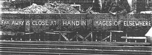
Until the wall was knocked down, ten years later, passengers would cruise past it as their trains slowed in and out of London. It was anonymous, 45 centimeters tall, and not very colorful, but a lot of people remember it. “Far away is close at hand in images of elsewhere.”
In his lovely A History of the World in Twelve Maps (the Daily Mail called it “jaunty”), historian Jerry Brotton calls the graffito “perhaps the best metaphorical description” of what happens when a person uses a map. You see a place on the map and you are transported there; the image collapses the distance between you and the place to nothing. Knowing how to use a map, however, a geographical machine clicks and whirrs in your imagination and you end up able to define, accurately, the distance between you and the other place. Close at hand, far away.
But how has that geographical machine in your head been shaped by the conventions governing how maps are put together? A map has a metaphorical relationship to a real place — it always processes the place in some way — and that mediation can have an important effect on how we imagine the world.
So, it makes a kind of sense that Jerry Brotton and artist Adam Lowe have made one of those insane public art objects that really make you go “huh”: a three-dimensional, full-sized, plaster relief facsimile of the Hereford mappa mundi, the largest and loveliest surviving medieval world map.
The facsimile is, according to Brotton, partly a rhetorical attack on Google Maps. There really is a way this makes sense. Let’s start, however, with the Hereford mappa mundi, which is my favorite map of all time.
Completed in 1300, the map is still on display in Hereford Cathedral — Hereford is halfway from Cardiff to Birmingham — for everybody to look at.
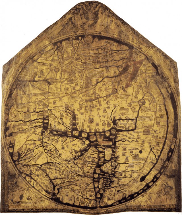
Hereford Mappa Mundi. Reproduced by kind permission of Factum Arte, The Dean and Chapter of Hereford and the Hereford Mappa Mundi Trust.
Isn’t it beautiful? And big! 64 by 52 inches. You can kind of tell from the shape that it was made from a huge cowskin. It is more than 700 years old, though, and thus muddy and incomprehensible to the contemporary eye (accustomed as we are to a brightly-colored world).
Still this is, despite appearances, a map of the world. You need to know four things to understand what’s going on.
First, medieval Europeans only really knew much about Europe, Asia and Africa. Each continent was supposedly founded by a son of Noah, so they divided the world into three. This is called a O-T map, because the T divides up the O of the outline of the world, while usefully standing for orbis terrarum, ‘circle of the lands.’
Second, the map is oriented with East at the top. Jerusalem is right in the middle. West — Europe-ish — is at the bottom. The sun rises in the East, so this makes sense. This is also why the word is “oriented,” if you’re interested in that kind of thing.
Third, paradise is in the East, and not for no reason. The map depicts the Christian version of history in a westward progression: from paradise to Europe, from creation to the present day (and impending apocalypse, since we’re in the last Age of Man), from top to bottom.
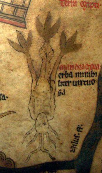
Fourth, the map is filled with drawings of monstrous people, crazy animals, and weird little scenes. For example, please enjoy this mandrake.
Here are some clumsy annotations by my own fair hand.
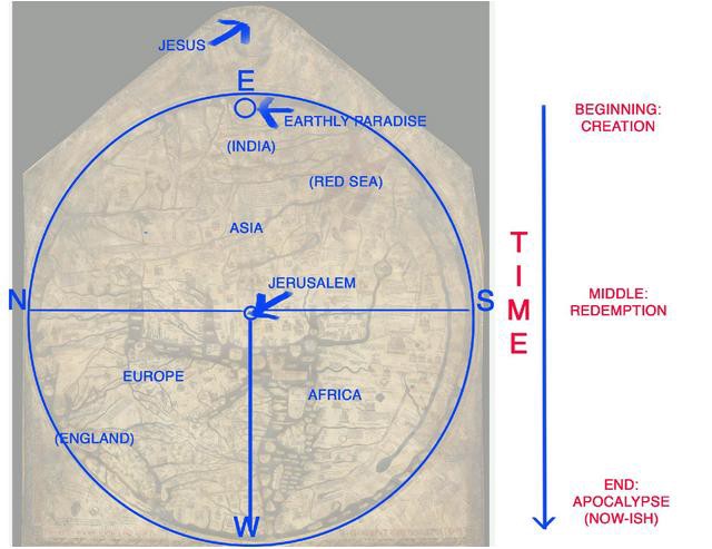
It probably doesn’t matter if you don’t entirely process this information, but it’s good to know. I find this era of map-making totally fascinating, however, because it shows the origin of a lot of the strange ideas we have about far-off places. For example, the medieval Jerusalem is the “navel of the world”: the timeless fulcrum where the crucifixion took place and shadows are rumored never to fall. The overloaded symbolism of Jerusalem in today’s world makes a little more sense when you realise that people literally thought it was the centre of the universe for hundreds of years. The crusades certainly make more sense philosophically, and it explains why so many Europeans found their way to the Middle East as pilgrims in a time before commercial travel. The map emphasized Jerusalem in a way a sermon couldn’t. This is what I mean about the metaphorical relationship between a map and a place having important payoffs.
Which brings us to the new fascimile. Jerry Brotton recently unveiled it at the Hay literary festival, in collaboration with artist Adam Lowe. Lowe founded a studio called Factum Arte, who have developed an amazing new piece of technology called “Lucida.” Lucida is a new 3D “non-contact” laser scanner intended for imaging the surface of artworks, developed by artist and engineer Manuel Franquelo. So Lucida recorded the surface topography of the map, which undulates with ink and scoring and rumpling. Here it is at work.
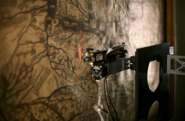
From this scan was made a three-dimensional facsimile. As Factum Arte describe it, the original map “has been routed — literally carved — to reveal every aspect of the surface.” The reproduction is in plaster relief, with the depth of the relief doubled to amplify the most subtle indentations.
Here is the facsimile being carved.
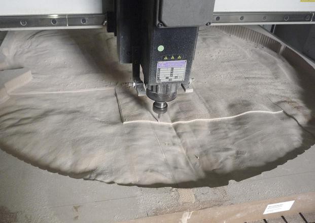
Process of routing the 3D information of the Hereford Mappa Mundi at 1:1 scale in Factum Arte’s workshops in Madrid.
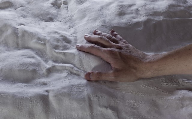
Can’t you just imagine the smell of plaster? And here is the final thing, which has just been unveiled and is now on display at Hereford Cathedral. You can touch it!
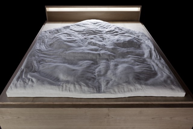
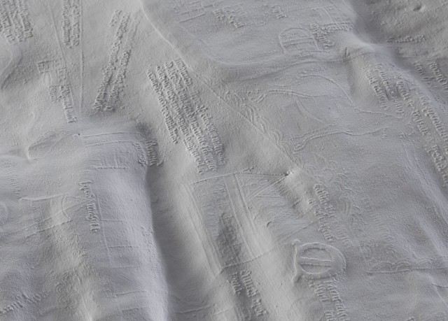
I think it’s beautiful, especially up close. Plaster has a lovely, cool, matt quality. Delicate, tiny details, like the Minotaur’s Labyrinth at Crete, show the painstaking craftsmanship of the mapmakers.
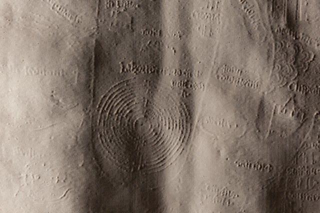
Detail of the texture of the routed sample of Hereford Mappa Mundi’s 3D information. All marks of the map’s texture were captured and reproduced.
In a lot of ways, this is just a great model to have next to the real map at the Cathedral. It’s educational — you can get up close, run your hands over it. I work in medieval studies, so I’m delighted to see a fragile artefact made touchable, learnable. It’s also just nice to look at. God knows there are enough horrible public artworks knocking about British town centers.
But, in another way, I really sympathise with the point that Brotton makes in his Telegraph piece about the map:
…digital technology like Factum’s enables us to see the globalised world very differently from the monetized geospatial applications pre-programmed on our phones and computers. I would like to see digital mapping that does not turn the globe into an “application platform” from where businesses trade “actionable information.”
The technology behind the Google Maps in your phone is, of course, a very different kettle of fish to the Lucida — perhaps much more different than Brotton’s piece implies. I am happy about any person in the public eye, however, who draws attention to the weirdness that is today’s smartphone-mapped world.
I mean, don’t you think it’s weird? People have got pretty up in arms about Street View, but not really about the sea-change in navigation that the Maps app has brought about. Maybe I care too much about maps (very possible). But I think it’s weird that Google only started working on Google Maps (and bought up the project that would become Google Earth) because Google users were doing a lot of local-area based searches (it used to be called “Google Local,” you may recall). Now, I get that Google Maps is a business product and thus must monetize, but the product is saturated with advertising. Your map experience is becoming ever more personalized. The distance you live from businesses is itself business.
Let’s disregard the fact that Google Maps sends us all in the same directions and recommends terrible restaurants. Let’s also disregard the gross history of the US military-developed, Gulf War-tested, government-maintained GPS system that finds you, the blue dot, wandering around looking for a restaurant, and tells you want to do.
The death of the paper-map experience is great for convenience and not getting lost and everything, but before you got turned into a pulsating blue blob you had to use a damned map. In other words, you used to have to understand the geography of a place before you found yourself in it. Or, like the London black cab drivers who have to know every street in the city in order to pass “The Knowledge,” you had to get to know the character of your home, understand its nature, before you got to enjoy it (if you think you know London, try taking the mock test for cabbies).
To quote the late, great cultural geographer Denis Cosgrove, “to map is in one way or another to take the measure of a world…The measure of mapping is not restricted to the mathematical; it may equally be spiritual, political or moral.” It’s everything to do with communication, to do with the code by which you navigate other people, about the way you see our shared planet. We need to find ourselves, but I hate that finding oneself today doesn’t mean looking around at our environment; it means looking straight down at a telephone. This new model of a weird old map at least reminds us that staring at yourself on a little square in the back of a screen-lit taxi is not the only way to see the world.
Josephine Livingstone is a British person and doctoral candidate at New York University. She likes taking antisocial photos and tweeting whatever. Images are copyright Factum Arte.
