The Rise And Fall Of Grunge Typography
The Rise And Fall Of Grunge Typography
by Sharan Shetty
Hop on the nostalgia train for a second. Think back to the 90s. To Nirvana, Linklater’s Slacker, and the flannel-clad rebels on the run from the 80s. To skateboards and graffiti and toe rings and VHS tapes. Things were messy then. And type design was messy, too. Words were splayed and chaotic, letters blurred. Textures were thick and heavy. Concert posters looked like someone had splattered paint on paper and then scratched out band names. You may have noticed it, you may not have, but at its peak, this typography style, called grunge, was ubiquitous. Alternative music cds, videogames, and zines — all the aggregate products of a wayward generation — appropriated its unfinished and frenzied aesthetic, and it became the largest, most cohesive movement in recent font design history.
It was everywhere — and then it wasn’t.
THE RAY GUN EFFECT
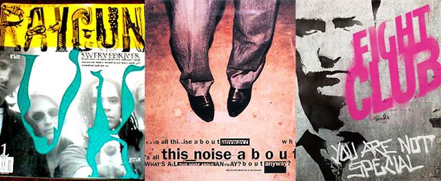
David Carson, the acclaimed graphic designer who created Ray Gun magazine, is the so-called Godfather of Grunge. His method was simple, his gospel twofold: you don’t have to know the rules before breaking them, and never mistake legibility for communication. Carson’s technique of ripping, shredding, and remaking letters touched a nerve. His covers for Ray Gun were bold and often disorienting. He once disliked a Ray Gun article on Bryan Ferry, and so set the entire spread in Zapf Dingbats.
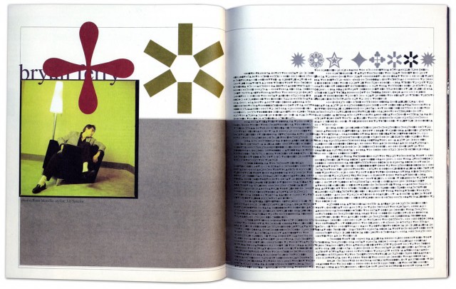
David Carson’s infamous Zapf Dingbats spread, featured in a 1994 issue of Ray Gun. (Via.)
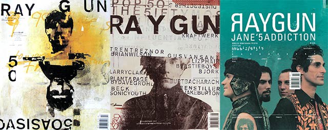
Some Ray Gun covers.
Carlos Segura, a Chicago-based graphic designer and founder of Segura Inc. and such type foundries as T-26, was a close witness to the grunge explosion. Signature grunge fonts, such as Hat Nguyen’s Droplet, Harriet Goren’s Morire, and Eric Lin’s Tema Cantante were all distributed by his foundries.
Like many other of the 90s’ best things, grunge typography was rooted in angst and discontent. “Grunge typography came in as a backlash, very much like how punk music came in,” Segura told me during a recent phone conversation. “It was almost like a societal complaint, if you will: everything was getting too clean. Design by people like David Carson also made it a very accessible direction to go on. We, as human beings, tend to follow more than lead, and everyone just started to do that David Carson look. … And there was, for a certain period of time, a certain refreshing look to it that had not been seen before.”
David Carson on “grunge” design and his method.
The aesthetic was fueled by raw emotion, but Carson’s tactics were made imitable by technology. The rise of grunge typography coincided with the burgeoning popularity of the Macintosh, which, introduced in 1984, permanently altered the landscape of graphic design and typography. The art of designing by hand — a painful craft of precision and consistency — was no longer the only option. Designers were liberated; the screen and their imagination were the only constraints. In many ways, the modifier “grunge” denotes for typography what it does for music: unfettered, unrestrained, a cry against convention. The experimental typographer is almost always the young typographer, and young typographers in the 90s, armed with new software and ideas, rejected the rule-based fonts of their forebears.
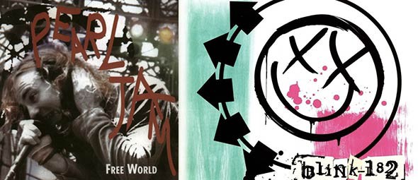
Pearl Jam and Blink-182 were two of many 90s bands that adopted grunge typography in their image.
From the viewer’s perspective, the appeal of grunge was based on a basic idea: it had not been seen before. It wasn’t just the experimental design of the letters, but the way they were placed on page. Its bedlam, its body language, resonated with the culture at large. This resonance produced a vital change in typographic method: in a field that was for decades dictated by the principle of neutrality — of meaning being implicit in the text rather than the typeface — fonts were succumbing to association with the genres or ideas with which they were paired.
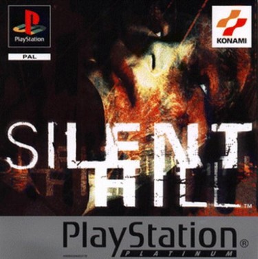
Silent Hill, along with other late 90s videogames, incorporated grunge typography into commercial advertising and covers.
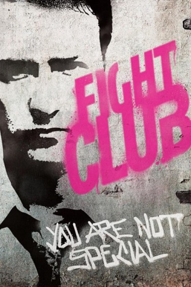
Indie movies like Fight Club often utilized the anarchic look of grunge typefaces.
THE STORY OF A SINGLE FONT
The beginnings of most grunge fonts were couched in moments of spontaneity, rather than purpose and precision. The idea was to instantly express. The story of Harriet Goren’s Morire is an ideal example: the design, inspired by a 16th-century Monteverdi love song entitled “Si ch’io vorrei morire”, is all sketch and shadows, as though the letters are in perpetual and subtle vibration. And yet, for such an intricate typeface, its creation was one of fleeting inspiration rather than premeditated artistic vision.
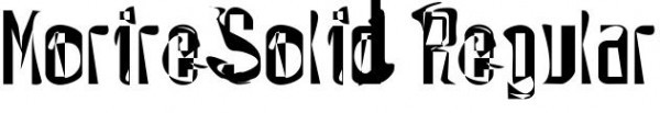
Harriet Goren’s grunge typeface Morire.
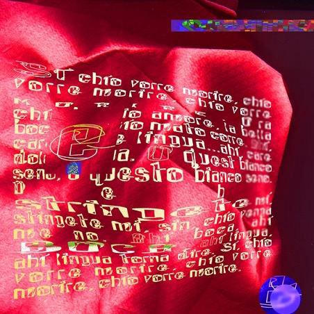
Morire-inspired art, created by Goren. (Used with permission.)
“When I made Morire, I had been a designer for a couple of years and was really bored with what I was doing,” Goren told me. “I spent a lot of time looking at contemporary typography and observing what was going on. I didn’t really consider myself part of any movement. I read an article, in Time magazine of all places, of a school in Camden, Maine called the Center for Creative Imaging. The article said it was like being in Florence during the Renaissance. I immediately thought ‘I have to go there.’”
“It was incredibly expensive, like $1,700 for three days, and there was an intensive weekend course called something like Experimental Typography. Now this is 1994 or 1993, so these concepts were fairly new. The teacher was P. Scott Makela, who died fairly young but was brilliant and part of that whole David Carson school. Not really knowing anything about the course, I registered, and paid the massive amount of money. The workshop turned out to be three people and the teacher in the class, and it was basically a three-day intensive experience. We didn’t even sleep. It was just three straight days of type design. They had state-of-the-art computers, at that time Macintoshes, and I had never had facilities like that. Makela gave us an assignment and over the weekend I designed the whole typeface. I wasn’t even on drugs.”
Makela was impressed enough to suggest sending the font to Carson. Goren, flattered and flush with doubt, copied it to a disc and sent it through the mail. A few months later, she bought a copy of Ray Gun; Morire was emblazoned all over the pages, fully credited and even used on the cover. Carson had previously left a voicemail expressing interest in the typeface, but had never guaranteed its inclusion. That was the nature of things: fast, inspired, and without pretense or hierarchy.
“I had no other connections with grunge typography, it was just my being influenced at the time,” said Goren. “I personally thought that a lot of what I was doing, and what other people were doing, wasn’t exactly aesthetically attractive. But I think it was an important step in getting people to break boundaries and really use the computer for what it’s used for now.”
In retrospect, it “was an amazing experience, and one that changed me creatively and entirely, really. At the time, I worked at a design studio and everything had to be done according to clients’ rules. You can do that for so long, but then you need another outlet. It felt very exciting to design letters that didn’t have to be read, in a way. Right after I designed Morire, I broke up with a long-term boyfriend. A friend of mine in Portland asked me to design a spread for his magazine, and I remember using my typeface and thinking ‘I’m gonna make this look really ugly.’ The spread was an illustration of a story, and when I was done you couldn’t read the story at all. It was just an expression of pure emotion and design. That’s really what it was all about.”
Goren’s narrative is not unlike other font designers of the era; Carson was notorious for his techniques, which largely involved slashing letters apart, overlapping and omitting vital words, and wreaking general havoc upon the spreads he produced. There was no method to the madness. At the peak of grunge typography, ideals such as kerning, leading, and spacing were stomped, forgotten, and left for dead. Letters became art. The uniformity of ascenders and descenders, the consistency of x-heights and baselines — these were archaic principles, and had no place in the type designer’s canvas.
THE DECLINE
The old guard was scandalized by this rebellion. In the documentary Helvetica, Maximo Vignelli, an Italian designer strongly based in the classical Modernist tradition, tears apart the extravagant tendencies of the grunge typographers, a “wasted generation” that was not “for anything” but “against everything.”
“There are people that think that type should be expressive,” Vignelli said in the film. “They have a different point of view from mine…You can say, ‘I love you,’ in Helvetica. And you can say it with Helvetica Extra Light if you want to be really fancy. Or you can say it with the Extra Bold if it’s really intensive and passionate, you know, and it might work.” Designers like Vignelli believe that typography should be a shell shaped by words, meant to hold language but never to elaborate upon it. It should, in their view, be unobtrusive, elegant, and, above all, timeless.
Such classical notions may triumph in the end. Somewhere in the mid-2000s, clean lettering and subtle spacing experienced a resurgence in popularity, and the use of grunge typography went into decline: conservative became modern, and chaotic became clichéd. Now, in 2012, this reversion to classicism is nigh complete — during our conversation, Segura noted that most demand for grunge fonts he gets comes from Latin America and Europe rather than the U.S. Segura founded T26 Digital Type in 1994, at the very peak of the movement’s dominance, and initially provided almost entirely grunge fonts. Now, almost 20 years later, T26 has around 100 grunge fonts licensed, but the vast majority of its database focuses on other styles of typography.
“At the very beginning…we were pigeonholed into that grunge segment for a few years,” Segura said. “A couple of years later, we made a concentrated effort to change our personality from a grunge type foundry to a type foundry; we didn’t accept any more grunge or unfinished typography, or fonts that didn’t have a full character set.”
One of those fonts was Goren’s Morire, which T26 stopped distributing in 2004. Demand for such typography weakened as the marketplace became oversaturated with grunge fonts and design trends turned toward simplicity. Ray Gun folded in 2000, one of many print casualties of the decade. And young typographers, once so enamored with the idea of throwing caution to the wind, started realizing the merits of restraint. Slowly and surely, the utility of grunge typography narrowed, until it was applied mostly as a novelty and very often as a gimmick. It began to look cheap, formulaic, boring. The cycle had come full circle, and technology facilitated the end as much as it did the beginning.
“There’s definitely still a conservative, classical movement in the type industry, but I do also think that movement is largely being dictated by web fonts,” said Segura. “Web fonts are obviously for the web, but, more importantly, what’s used on the web is made with the intention of clear readability. That emphasis on readability is really determining the current direction of where fonts are going. That’s exactly why at T26 we firstly focus on web font conversion with the more classical, readable fonts. It’s very rare for a web designer to use an experimental typeface.”
The disappearance of grunge typography can also be credited to human nature: techniques become less appealing, less refreshing, once they are used incessantly for nearly a decade. Cleansed of the burden of precedent, typographers began experimenting within the boundaries of convention. More importantly, grunge typography, like most things that outlive their relevance, simply didn’t possess the power of association or expression it once had.
As Goren put it, “I think after people got that out of their system and realized what they could do with their tools, typography became a lot more classic and reliant on the rules people thought were boring then. Now, pretty much everyone with the skills can design a typeface, so there are so many different voices and perspectives. There’s a lot of mediocrity, because that’s what happens when the tools are distributed to everybody. But I think the pendulum is now swinging toward good, elegant design, and that sort of trendiness of the 90s looks a little dated now. It was definitely a movement of its time.”
These days, Segura believes classic design has been overemphasized and overexposed, to the detriment of the industry. He believes true innovation has become rare. Though experimental typography should never be defined as solely grunge typography, he sees a troubling lack of originality in current type design.
“What I think happened is that it got so excessive that simple, clean typography became the ‘in’ thing,” Segura said. “Almost to the extreme, because then everyone started using Helvetica, and Helvetica was suddenly used as the default answer for every type design project. In my view, that’s also the wrong way to go, because I feel you should pick the right font for the right message. So typography got a little bit too conservative at that point.”
In many ways the demise of grunge is in perfect accordance with its ideals: change is constant, and rules can never be sustained. Despite what the classicists believe, design is not timeless. Neither was grunge typography. It belonged to and defined a very specific period of rebellion. It did so the same way blackletter strongly evokes daily newspapers and stiff men in suits and hats smoking cigarettes, or the way cursive suggests old, coffee-stained diary entries and dusty historical journals. It’s a testament to the enduring power of typography that the way a letter is designed — its curves, its thickness, its heft — can embody an era.
Sharan Shetty is an Awl summer reporter.