The Maps We Wandered Into As Kids
The Maps We Wandered Into As Kids
If I ruled the world, or at least a publishing company, all books would contain as much supplementary information as possible. Nonfiction, fiction — doesn’t matter. Every work would have an appendix filled with diagrams, background information, digressions and anecdata. And of course, maps. Lots and lots of maps. This predilection probably sprang from the books I read as a kid — books like The Phantom Tollbooth, The Hobbit and The Princesss Bride — all of which feature engaging maps that serve as gateways to imaginary lands. Here, say these maps, you’re in this other world now.
Norton Juster’s The Phantom Tollbooth
In the beginning of The Phantom Tollbooth, listless youngster Milo wakes up one morning to find a tollbooth has appeared in his room. He also finds a letter that includes “[o]ne (1) map, up to date and carefully drawn by master cartographers, depicting natural and man-made features.” The “master cartographers” here is, actually, the book’s illustrator, cartoonist Jules Feiffer (with some author assist). Feiffer’s involvement with Phantom Tollbooth came about incidentally — he and Norton Juster were neighbors in a Brooklyn Heights apartment bulding. Soon they became close friends,roommates and collaborators. As Feiffer remembers it, he would illustrate passages as Juster read them aloud. But the map was a bit of a sticking point. Feiffer hated to draw two things, horses and maps, and The Phantom Tollbooth included both. Juster sketched out the map’s basic dimensions, which Feiffer then traced and made over into his signature style. If Juster made him draw a map (and at least a few horses), Feiffer was able to sneak in a jab in return: the Whether Man’s appearance, a bald doughball in a toga, is based on Juster. In the 50th-anniversary edition of the book, the author jokes, “This was quite unfair, since everyone knows I never wear a toga.”
As a map: It’s a perfect example of where hand-drawn aesthetics work best in maps — across a small area mapped specifically for visitors, as the exaggerated landmarks are given weight over exacting spatial accuracy. In this way the unfamiliar can be easily spotted and identified. It’s a style commonly seen in attraction maps, like Anika Mottershaw’s Map of London or theme-park maps, like this one of Walt Disney World.
A.A. Milne’s Winnie the Pooh
The map of the Hundred Acre Wood appears in the first Winnie-the-Pooh book entitled, wait for it, Winnie-the-Pooh. Created by E.H. Shepard (who also illustrated The Wind in The Willows), the map is meant to appear drawn by Christropher Robin, with “Drawn by me and Mr Shepard helpd” written at the bottom and the cardinal directions on the compass marked as P-O-O-H. The storybook woods are based on the actual Five Hundred Acre Wood in Ashdown Forest, near Milne’s country home in Sussex. The original sketch for the map was owned, curiously enough, for a long time by Pat McInally, known in some circles for having the only perfect Wonderlic Test score and also being the first Harvard grad to play in the Super Bowl, which he did for the Cincinnati Bengals in 1981 (zing at you, Ryan Fitzpatick). McInally’s collection, including that preparatory sketch, is currently up for sale at Peter Harrington’s rare book shop in London, yours if you happen to have a spare £115,000 — that’s $182,241.73 — to burn.
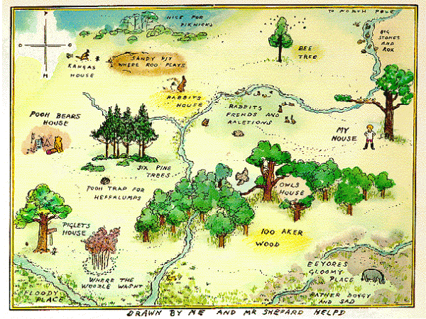
As a map: The key difference between a map like this one and the one from The Phantom Tollbooth is purpose. While Feiffer’s map is intended for exploration, Christopher Robin-E.H. Shepard’s map is a documentation of a known land. In an imaginary world, what’s beyond the borders doesn’t matter so much. Here the only indication of the world beyond is the “To North Pole” note, an obvious sort of landmark for a child’s map. With its focus on the “here” and elision of the “there,” a map of an imaginary world is not unlike early maps, such Hecataeus’ map of the world, drawn in approximately 500 BC, with its amorphous borders of “ocean.” Both Hecataeus and Christopher Robin are making the same point — sure there’s probably other stuff, but this is what’s important.
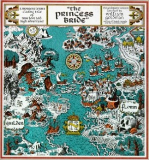
William Goldman’s The Princess Bride
The Floren and Guilder kingdoms described in The Princess Bride are located “between where Germany and Sweden are today.” For any other geographic particulars about the countries, the reader has to consult the map found in the endpapers (in some editions, a fold-out map in the center), drawn by William Goldman (if other illustrators made the map, I haven’t been able to find a reference to them). The map is a doozy — jammed full of details, landmarks, labels, and with no perspective whatsoever. I mean, the Sun is on this map. The trees are the same size as the ships.
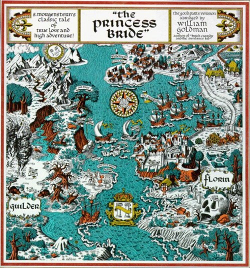
As a map: The map is deliberately evoking the feel of a Medieval illuminated manuscript, as this is an exaggerated version of how many maps looked around the times of princesses and feudal castles. Though examples of these kingdom-level maps are abundant and accessible, I’d like to particularly draw your attention to collection of sixteenth-century maps of Jerusalem, made available by The Jewish National University Library. The gallery beautifully illustrates the diversity to be found in this type of region-specific map. While none of them include the Sun, like Goldman’s map, they often use multiple perspectives to show the mapped lands.
L. Frank Baum’s The Wizard of Oz
All told, Baum drew forty individual maps of Oz to accompany his novel. This is the major one, though, showing the entirety of the land and its surrounding areas. The Emerald City, in the center, is surrounded by four distinct countries. The countries are bordered by deserts (Great Sandy Waste is the obvious winner here and a great potential new name for the litterbox). Beyond the deserts like a number of intriguing countries that make at best a passing appearance in the story, such as Merryland and the Country of Gargoyles. “Kansas” of course appears nowhere.
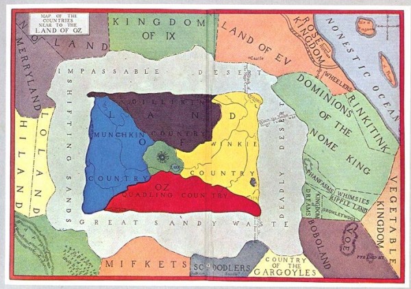
As a map: A straightforward map if ever there was. One thing to note, though: the compass is reversed, East and West are switched. This is an L. Frank Baum original error! The first copy of this map was on a glass slide, when Baum went to make a paper copy he traced it backwards. It’s a great example of a political map — it’s easy to imagine it as a pulldown over the chalkboards of Oz classrooms. I’d direct you to a political map to look at for comparison, but we all know what those look like. Instead, let’s take a peek at the map drawn for Gregory Maguire’s Wicked. First of all, while there’s no North arrow, the cardinal directions have been corrected from Baum’s original. This map gives a more nuanced view of Oz, complete with a legend and some topographical definition. If the first map was a classroom pulldown, this is the map on the quiz at the end of the chapter on which you have to label all the features.
J.R.R. Tolkien’s The Hobbit
Like The Wizard of Oz, The Hobbit contains many, many maps. Most of them were drawn by Tolkien’s son, Christopher, but Thror’s Map was drawn by Tolkien himself. In the story, Gandalf gives this map to Bilbo at the beginning of the story, the impetus for our hero’s “unexpected journey” to recover the dwarves’ treasure from Smaug, the dragon of Erebor.
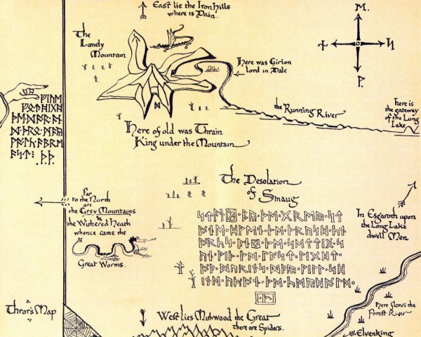
As a map: Drawn more or less to scale, Tolkien’s map shows locations in relation to each other with only sparse detail — only what you absolutely need to know to get where you’re going, no hints of what else is out there. A modern example would be something like this charming map called “Getting Drunk on Passyunk.” Only the information you require, all of the in-betweens omitted. It’s the sort of map you might draw on a napkin for a friend from out of town who isn’t sure where she’s going. “Oh, sure, once you leave my house, you take a left. When you get to the donut shop make another left, then veer right at the house with the spaceship mailbox. If you get to the traffic circle, you’ve gone too far. Presto: you’re at Erebor!”
Ellen Raskin’s The Mysterious Disappearance of Leon (I Mean Noel)
Okay, so this one isn’t a map of an imaginary land — the United States wasn’t conjured out of Raskin’s imagination — but it is a lovely chapter title page. I include it here because a) Ellen Raskin is the bee’s knees and b) this was one of my favorite books as a young girl (I borrowed it from the library so often that the librarians finally just gave it to me one day). In this case, the map serves as a symbol of what’s happening in the book: Protagonist Mrs. Caroline Fish Carillon’s search for her missing husband is centered on her only clue, a half-heard phrase from a drowning man, “Noel(glub) see (blub) all… I (glub) new…”. The power of words, right? Anyway: she takes the final word as an indicator of location and crisscrosses the country to check every town that starts with “New.”
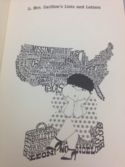
As a map: This typographic style of map has become incredibly popular over the past few years, particularly as a way to show a city by its neighborhoods. But a map made completely of words is nothing new. Edwin Morgan’s Chaffinch Map of Scotland, a poem published in 1965, uses the regional variations of names for a common songbird to create a map of his country. Howard Horowitz’s poem “Manhattan,” reproduced here, appeared in The New York Times in 1997. Flickr user amapple has created a small but impressive set of maps focusing on such linear features as the Mississippi River and the Silk Road. Typographic mapping makes an impact even when the words aren’t locations. National Geographic included a type map of US surnames in its February 2011 issue, and an an interactive viewer is available on their website. My last name is everywhere.
On a final note, I’ll point out a notable map omission from recent literature: I couldn’t believe The Hunger Games didn’t include a map of Panem!!! This is exactly what I meant when I said that books should have as much supplementary information as possible. But evidently, there are a lot of us spatial types out there, and an assortment of reader-drawn maps have popped up. My favorite belongs to Livejournal user “aimmyarrowshigh,” who describes the process she used to determine national borders and each district’s location. The result is a spectacular map that would make any cartographer proud.
Previously: Blame It On Volcanoes and Pictures Of You From Space
Victoria Johnson is The Awl’s resident cartographer. Hobbit and The Princess Bride maps via Woodge.