I Object To Your Projections
Have you seen that episode of “The West Wing”? This is a Fun with Maps column, so you know which one I mean. The one where it’s Big Block of Cheese Day, and CJ meets with the Organization of Cartographers for Social Equality? If that’s not ringing any bells, here’s what happens: the organization is promoting an alternative to the Mercator projection, that is, the version of the world map with which you’re probably most familiar — it’s the one that has Greenland as roughly the same size as Africa. The group would prefer the Peters projection be used, because it doesn’t exaggerate the size of Europe and North America at the expense of non-Western nations, which appear proportionally a lot smaller the closer they are to the Equator.
Well, the organization might be fictional, but it’s an entirely real controversy. Arno Peters, a German historian, unveiled his eponymous map in 1973 with the goal of displaying all nations with accurate sizing. The Gall-Peters (sometimes just ‘the Peters,’ even though James Gall had created the same projection a full century before. Peters’ unwillingness to credit Gall’s contribution did not win him many fans in cartographic circles) preserves area all right, but the shapes of the continents are completely distorted, especially toward the poles.

Look at Russia — the area is technically correct, but the shape is elongated East-West and flattened. Closer to the equator, countries are drastically elongated North-South.
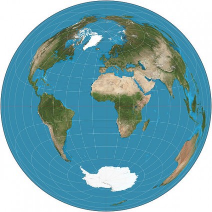
Map projections are just different ways of translating the dimensions of a globe onto a two dimensional surface. A sphere (or oblate spheriod, if you want to be fancy) can’t be flattened without causing some kind of distortion, be it in scale, area, distance and/or direction. Distortions in scale mean that a linear inch from one section of the document may mean 1 mile in the middle while an inch measured from another place could be a completely different length on the ground. Distortions in area means that size is not consistent across the map, which is how you end up with Greenland and Africa looking like landmass equals. Distortions in distance are similar to scale, in a way. On a map made to conserve distance, you could place a dot on the map with a circle drawn around it, and all points on the circle would be equidistant from the original dot. The Azimuthal Equidistant is such a map. Look at it and see — the distance from the North Pole to Washington, DC is accurate. The distance from the North Pole to Warsaw, Poland is accurate. But the distance from Washington, DC to Warsaw, Poland? No way. Directional distortions have to be avoided on maps used for navigational purposes. On a map made to preserve direction, such as the Mercator, you can place your finger on Chignik, Alaska, and move it in a straight line south through the Pacific to hit Honolulu. But on something like the Goode homolosine, which doesn’t preserve direction? That line would be kinda lumpy.
Projection methods fall into four classes.
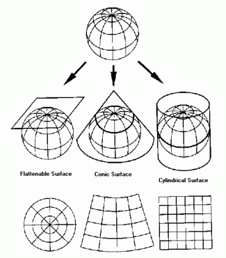
• Cylindrical projections are basically what you’d get if you wrapped a flat surface around the globe. The globe being a globe and therefore round, the cylinder would only actually be tangent to the planet along a line of latitude, usually the equator. In the most direct form, longitude and latitude lines are at right angles to each other. Longitudinal meridians are all the same distance from from one another, while the latitude lines get further and further apart as you get farther from the equator. A transverse cylindrical projection switches the longitude and latitude lines, an oblique cylindrical projection uses any other line.
• Azimuthal, or planar projections use a point. Think of a flat surface held up to the planet: it would only touch at one point, right? Lat or long lines passing through the point would be represented as straight lines, all others would be circles.
• Conic projections, as you might be expecting at this point, show the spheroid surface of the planet as a cone — picture a globe in a dunce cap. Meridians will appear to converge at a point, usually the North or South Pole, while latitude lines will appear as parallel arcs.
• The fourth category is comprised of pretty much every map that doesn’t fall into any of the above three categories. This includes maps that simply aren’t projected, like hand-drawn guides or ones that don’t represent the earth, like star charts.
To figure out which map projection is right for you, channel your inner cartographer and combine a distortion you’d like to avoid with a method that will help you to avoid it.
The Mercator projection that we’re familiar with was actually one of the first well-known map projections. It was developed in the 16th century by Gerardus Mercator, a Flemish cartographer and fan of floppy hats, in part to decrease shipwrecks, which can happen when you’re sailing without a trustworthy map. His Mercator projection is a straightforward cylindrical projection with the tangent at the equator, meaning that all latitude and longitude lines are at right angles to each other. The map preserves direction with rhumb lines and can be used for accurate navigation at sea. But the same grid that keeps direction standard distorts area and scale; see how, as mentioned before, Greenland and Africa look the same, right? Africa is, in actuality, 14 times larger than Greenland. The boxes formed by latitude and longitude lines are all technically the same size. But the stretching that occurs on his map closer to the poles greatly distorts the North-South distance as compared to the East-West distance, which stays the same regardless of where you are. You can see why this annoyed Arno Peters.
So you want a projection that preserves area? Good news! There are a lot of projections out there for you! And most of them have the helpful term “Equal-Area” right in the name. Let’s review some options: here are cylinder, azimuth, and conic projections that preserve area, published by the Swiss mathematician Johann Heinrich Lambert in 1772.
Lambert Equal Area Cylinder
….but look at that scale!
Lambert Equal Area Azimuth
… but look at those angles!
Lambert Equal Area Conic
… but look at those angles and that scale! Siiiiigh.
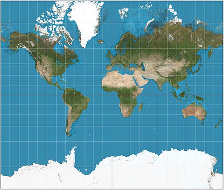
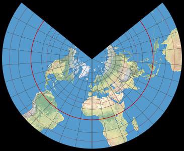
Okay, so let’s conserve distance. The Polar Azimuthal Equidistant projection, with which you may be familiar if you spend a lot of time staring at the UN emblem, uses the North Pole as the center point. Distance is correct, but you’ve thrown area out the window. I mean, is Greenland really the same size as New Zealand? But it is useful for some things, like airline routing.
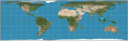
What if you want to just have a general map? A nice, inoffensive map that distorts everything, but just a little bit and an equal amount across the board? In 1989, seven individual societies of professional cartographers gathered to discuss tactics for educating the public on the effects of map distortion. They put forth a resolution to “strongly urge book and map publishers, the media and government agencies to cease using rectangular world maps for general purposes or artistic displays. Such maps promote serious, erroneous conceptions by severely distorting large sections of the world, by showing the round Earth as having straight edges and sharp corners, by representing most distances and direct routes incorrectly and by portraying the circular coordinate system as a squared grid. The most widely displayed rectangular world map is the Mercator (that is, a navigational diagram devised for nautical charts), but other rectangular world maps proposed as replacements for the Mercator also display a greatly distorted image of the spherical Earth.”
So what should we use instead of the wildly distorted Mercator and Peters? The Robinson Projection was accepted by academics as an agreeable middleground map, one that distorted everything a little instead of preserving one aspect at the expense of all the others. Following the cartographer societies’ lead, the National Geographic Society used the Robinson for official maps from 1989 until 1998, when it was replaced with the Winkle Tripel, generally thought to be a more attractive and balanced view of the earth. I think it looks pinched, but my formative map years were spent gazing at the Robinson.
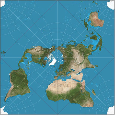
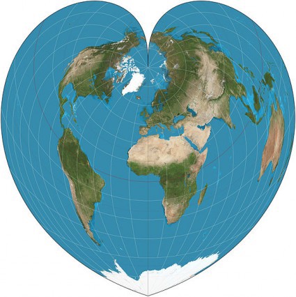
These aren’t the only ways to show the world, of course, there are hundreds of projections out there. Here are three notable for their nonconformity:
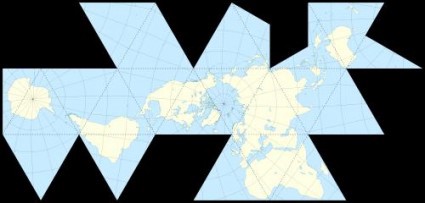
Buckminster Fuller’s Dymaxion map, a polyhedron that eliminates the cardinal directions.
The Peirce Quincunial, where the equator is a square.
And finally a gem, unearthed by Strange Maps, from the woefully short-lived Globehead! Journal of Extreme Cartography: Catherine Reeves’ Equinational Projection, which allocates each nation the exact same amount of space by reducing them all, equally, to a simple square. If only it were that easy…
Victoria Johnson is a cartographer and this is her Tumblr.
Map images courtesy of Wikipedia.