The Album Covers of Britney Spears: A History
by Phil Freeman

I can’t remember what any of the singles from the last four Britney Spears albums sounds like. Early singles like “…Baby One More Time,” “Oops! I Did It Again,” and even “Not A Girl (Not Yet A Woman)” were catchy and memorable. None of her more recent material has stuck with me in the same way. What’s most striking about her discography, for me, is the awfulness of the cover art. Since the cover for her new album, Femme Fatale, has been released today, I think a review is in order.

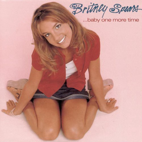
…Baby One More Time (1999): Generic and of its time. It looks exactly like one of the promo images that were mass-emailed to magazines like Tiger Beat, with a logo and album title slapped on in a 15-minute Photoshop session by an intern.

Oops!…I Did It Again (2000): An attempt to be more “adult” and sultry (peering from behind beaded curtains), undermined by, again, terrible typography and what looks like a head-swap.

Britney (2001): The awful color scheme and general washed-out-ness of the photo make this look like it’s not even from America; it looks Scandinavian somehow. The logo font is terrible, again, but it’s a different kind of terrible — it looks like something from an Opeth single.

In the Zone (2003): This one is the absolute nadir. The blue-tinted head shot, the stock font; it looks like the cover to a cassette single from 1990 by some dance-pop one-hit wonder.

Blackout (2007): Some people love this one, some people hate it. It looks cheap, as always, with no association between the photo of Spears, the text, those geometric designs, and whatever’s behind them. No element is in any way connected to the others.

Circus (2008): This is kind of a step forward, in that it seems like they actually tried to pick a “circus-y” font and color scheme. Spears’ ensemble and pose, and the curtains behind her, don’t exactly scream Ringling Brothers, though.

Femme Fatale (2011): This looks like the cover to a Britney Spears calendar, with a title font that could have come straight off a disco-era Olivia Newton-John album. (Olivia Newton-John’s album covers are a great example of how to do “vaguely vapid blond-girl gazes benignly at the camera,” by the way. Britney’s team should really do some research into this stuff.) Based on what’s come before, it could have been a whole lot worse.
Related: Seven Is A Magic Number
Phil Freeman is the editor of Burning Ambulance and a freelance writer for the Village Voice and lots of other places. He will harangue you at great length about the superiority of Japanese pop if you let him.
