Design and Meaning: A Tour of Romenesko Through the Ages
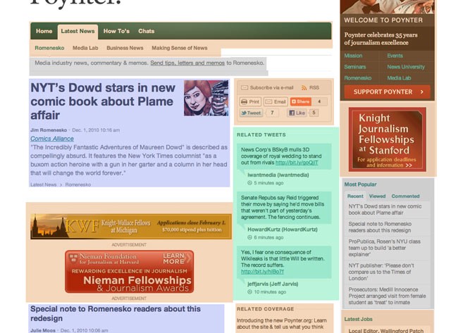
The Poynter Institute preemptively discourages you from complaining about today’s new redesign of the wonderful Jim Romenesko’s blog. (But seriously now, if I wanted to read these embedded tweets by Howie Kurtz and Jeff Jarvis… obviously I’d follow them on Twitter, right?) So? Whatever could readers be complaining about? Let’s take a tour of Romenesko throughout the decade!
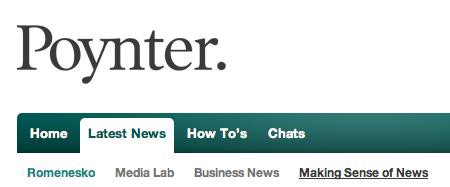
It also seems important to point out the most notable thing on the page as of today. What is that super-giant word on Romenesko? The word is “Poynter.” (The period is part of their “thing” now. Just like “Aol.”!)
(Note: the broken images below are due to the imperfect, if wonderful, storage by Archive.org.)
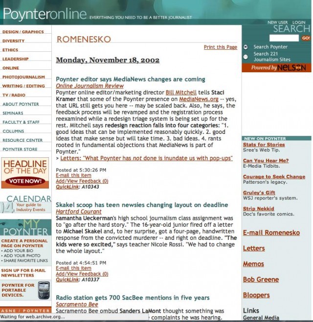
November, 2002:
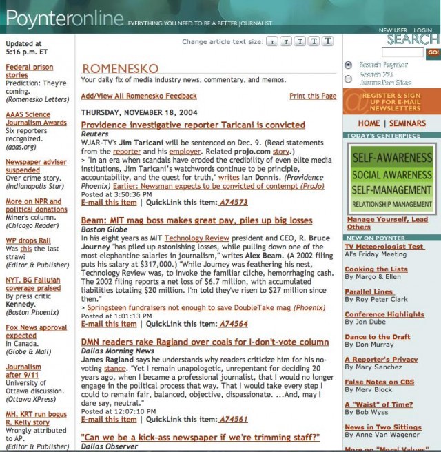
November, 2004:
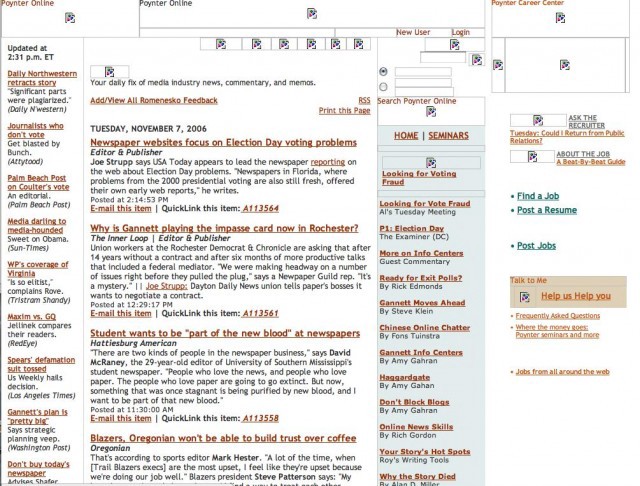
November, 2006:
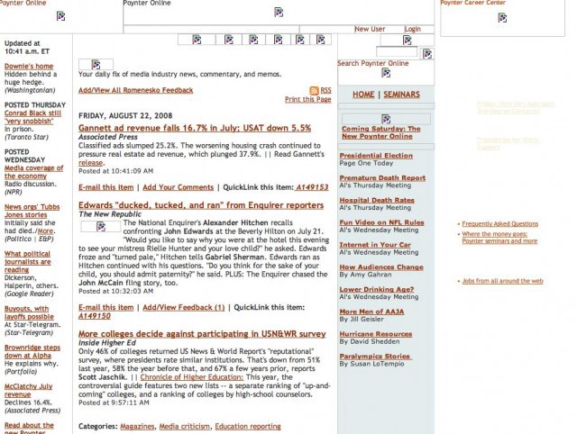
August, 2008:
The archive from August 2008 to the present is unavailable, but the intermediate redesign was a progression towards the current. (“[O]n all four sides the site wants to zip me away from Jim’s space,” is how Jay Rosen described that incarnation.) Jim Romenesko said at the time that “our stats show that the majority of people go to my part and don’t move off of it, and obviously we want people to explore the other parts of the site.” Well, it’s a little over two years later and we pretty much still don’t care what else is on Poynter.
Let’s see what’s here:
Key:
Blue: Actual editorial space.
Grey: Related editorial space.
Green: Other people’s editorial space.
Orange: Poynter promotional crud.
White: A whole load of whitespace.
What readers are complaining about is that what’s happening to newspapers and journalism sites is pretty expertly summarized by what’s also happening to Romenesko’s web presence. Which should be, it seems, the wrong message for a pro-journalism site to be conveying.