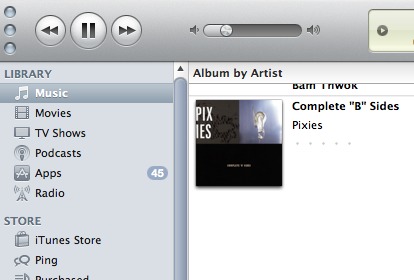
iTunes 10 Is So Incredibly Ugly

Jesus Lord, iTunes 10 is ugly. It’s so ugly! From the dock logo to the buttons to the icons to the spacing to even little tiny things, like the shade of the grey background and the shade of the fonts and the recasting of the volume bar-everything about it seems hideous, clunky, metallic; it feels impossible to get one’s little trackpad to navigate these blocky boxy things. Is there not a senior gay in Apple product design to throw up his hands and send a design like this back to the youngsters? I know there’s decided gay presence in the retail store design, which explains why their stores are largely so successful in terms of siting and presentation and flow and drama. But this-this is garbage!
