Bob Noorda And The Best Sort Of Boredom
Bob Noorda And The Best Sort Of Boredom
Graphic Designer Bob Noorda died two weeks ago in Italy. He was 82, and, as the Times notes, he “helped introduce a Modernist look to advertising posters, corporate logos and, in the 1960s, the entire New York City subway system.” When you consider how ubiquitous and helpful the MTA’s color-coded Helvetica signage and maps are, not to mention all the knock-off t-shirts sold on St. Marks, and, now, the custom-made signs available for personal use, Noorda goes down with folks like Milton “I Heart NY” Glaser or Louis B. Tiffany-who designed the interlocking “N” and “Y” that would become the Yankee’s logo, in 1877, originally as a medal of honor for the first NYPD cop shot on duty, an officer named John McDowell (that’s interesting!)-as a giant of the city’s visual history.
Of course, considering something as ubiquitous and utilitarian as subway signage might be considered very boring. But only in the best way. Also in the Times yesterday, in the Book Review section, was an article by Jennifer Schuessler about the subject of boredom in literature. The article had a terrible title, Our Boredom Ourselves. (No one should ever use an “Our [Noun], Ourselves” title again. Also, even more importantly, “[Name] Is Ready For [His/Her/Its/Their] Close-up.”) And it should have mentioned Nicholson Baker’s wonderful novel, The Mezzanine, which is about nothing more than an office worker’s trip downstairs to pick up a sandwich and back, with a stop in the bathroom, and is somehow mesmerizing. But Schuessler did include a nice description of tedium from The Pale King, David Foster Wallace’s unfinished novel about “the inner-lives of number-crunching I.R.S. agents,” which Little, Brown and Company will publish next year. And these lovely thoughts from a note Wallace left with the manuscript:
Bliss-a second-by-second joy and gratitude at the gift of being alive, conscious-lies on the other side of crushing, crushing boredom. Pay close attention to the most tedious thing you can find (Tax Returns, Televised Golf) and, in waves, a boredom like you’ve never known will wash over you and just about kill you. Ride these out, and it’s like stepping from black and white into color. Like water after days in the desert. Instant bliss in every atom.
Is that bliss like the enlightenment Buddhist monks are going for when they sit and think of nothing for ten hours at a time? Or rake the same pebble garden all day, every day, over and over and over again? (Gavin Rossdale doesn’t think so. Van Morrison doesn’t know.)
Either way, it’s probably something a guy like Bob Noorda could have related to. The obsession with minutia that will have graphic designers arguing the comparative strengths of various typeface til the wee hours of the morning must open up into that same kind of rapture. Certainly, one hopes it does, for their sake. In his exhaustive 2008 essay, The (Mostly) True Story of Helvetica and the New York City Subway, calligrapher, typographer and New York historian Paul Shaw goes way, way deep into the work Noorda and his colleagues did for the MTA, exposing important truth behind the typeface. Or at least, truth.
There is a commonly held belief that Helvetica is the signage typeface of the New York City subway system, a belief reinforced by Helvetica, Gary Hustwit’s popular 2007 documentary about the typeface. But it is not true-or rather, it is only somewhat true. Helvetica is the official typeface of the MTA today, but it was not the typeface specified by Unimark International when it created a new signage system at the end of the 1960s. Why was Helvetica not chosen originally? What was chosen in its place? Why is Helvetica used now, and when did the changeover occur? To answer those questions this essay explores several important histories: of the New York City subway system, transportation signage in the 1960s, Unimark International and, of course, Helvetica. These four strands are woven together, over nine pages, to tell a story that ultimately transcends the simple issue of Helvetica and the subway.
Shaw writes about interesting things like how a simple misunderstanding at a print shop led to the thick line that tops the lettering of subway signs (it was originally meant to represent an encasing frame) and how the original black-on-white signs changed to white-on-black (defense against grime and graffiti) and how Noorda and his design firm Unimark originally chose Standard Medium, not Helvetica, to be the official MTA typeface in 1966-a decision based on careful, and probably very tedious, process.
Noorda spent three weeks as a ‘mole’ tracking the paths of commuters in these stations to find the essential message points-entering/exiting, transferring-for each sign. He plotted decision points on a tree diagram. And, as in Milan, he viewed signs in perspective to test their legibility.
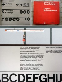
In 1970, Unimark released The New York City Transit Authority Graphic Standards Manual.
Research has shown that the most ‘appropriate’ typeface for this purpose is a regular sans serif. Of the various weights of sans serif available, Standard Medium has been found to offer the easiest legibility from any angle, whether the passenger is standing, walking or riding.
“It was an incredibly courageous thing to do at a time when Helvetica was riding high,” said Shaw, in a 2008 interview with the Times. I love that, the thought that a choice of typeface might be considered “incredibly courageous.”
The switch from Standard Medium to Helvetica took place in the 1980s. Apparently the result of technological advances. As Shaw writes:
The 1989 MTA Manual listed the following equipment: digital type (Linotronic), phototype (Compugraphic and typositor), tape-based lettering systems (Kroy and Merlin), computer-driven letter- and stencil-cutting systems (Gerber Signmaker), vinyl self-adhesive letters (from various manufacturers) and fabricated or cut-out letters in plastic and other materials. The only typeface that was available on all of these systems and methods was Helvetica.
After reading Shaw’s essay, I’m not sure I’d use agree that it “transcends” the subject of subway sign typeface. I can’t honestly say that all nine pages had me enrapt (you may very well be feeling the same way about this post!) But I love his passion. And that of other design geeks-in fact, of all geeks everywhere. The comments at the design site Aiga, which published Shaw’s article, are glowing and terrific. And heartwarming.
Says a commenter named Friends: “I really can’t get enough articles on typography. This is great-thanks, Paul Shaw.”